SlideSwift
By Category
💼Business 📊Infographics □Minimal 🕐Timelines ✨Neumorphic 🗑Diagrams 🔄Flow Charts ✨Glassmorphism 🎨Creative 🌍Abstract 🔄Cycle Diagrams 💎Isometric 🖼Illustrations 📱Social Media 🗺MapsBy Slide Type
🚀Pitch Deck 📌Roadmap 🔍SWOT Analysis 📅Timeline 📈Gantt Chart 🏢Org Chart 📋Funnel ⚖Comparison 📄Case Study 📋Agenda ⭐Icons & Lists 👏Thank You
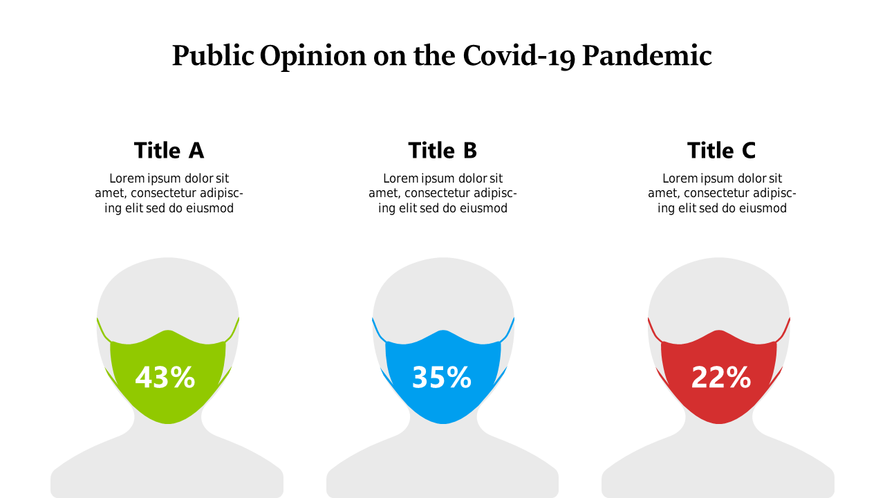
When presenting data, clarity is key. If you’re struggling to convey public sentiment regarding COVID-19, this slide can help. It showcases a segmented bar chart that neatly breaks down opinions into three distinct demographic categories. The color-coded sections make it easy for your audience to grasp the nuances in public opinion at a glance. As a finance lead, you can use this slide to highlight crucial trends that may impact budgeting or resource allocation. Data analysts will find it invaluable when summarizing survey results, allowing them to draw conclusions quickly. Business analysts can leverage this slide to provide insights in presentations, making complex data accessible to stakeholders. Plus, you can easily customize the colors and labels to suit your presentation’s theme. This slide not only enhances your visual storytelling but also supports your analytical findings. $0.99 — add this single slide to any deck from the SlideSwift Slide Library. No subscription needed. Mix slides from any category to build your perfect deck.
Add more from this category to your custom deck