SlideSwift
By Category
💼Business 📊Infographics □Minimal 🕐Timelines ✨Neumorphic 🗑Diagrams 🔄Flow Charts ✨Glassmorphism 🎨Creative 🌍Abstract 🔄Cycle Diagrams 💎Isometric 🖼Illustrations 📱Social Media 🗺MapsBy Slide Type
🚀Pitch Deck 📌Roadmap 🔍SWOT Analysis 📅Timeline 📈Gantt Chart 🏢Org Chart 📋Funnel ⚖Comparison 📄Case Study 📋Agenda ⭐Icons & Lists 👏Thank You
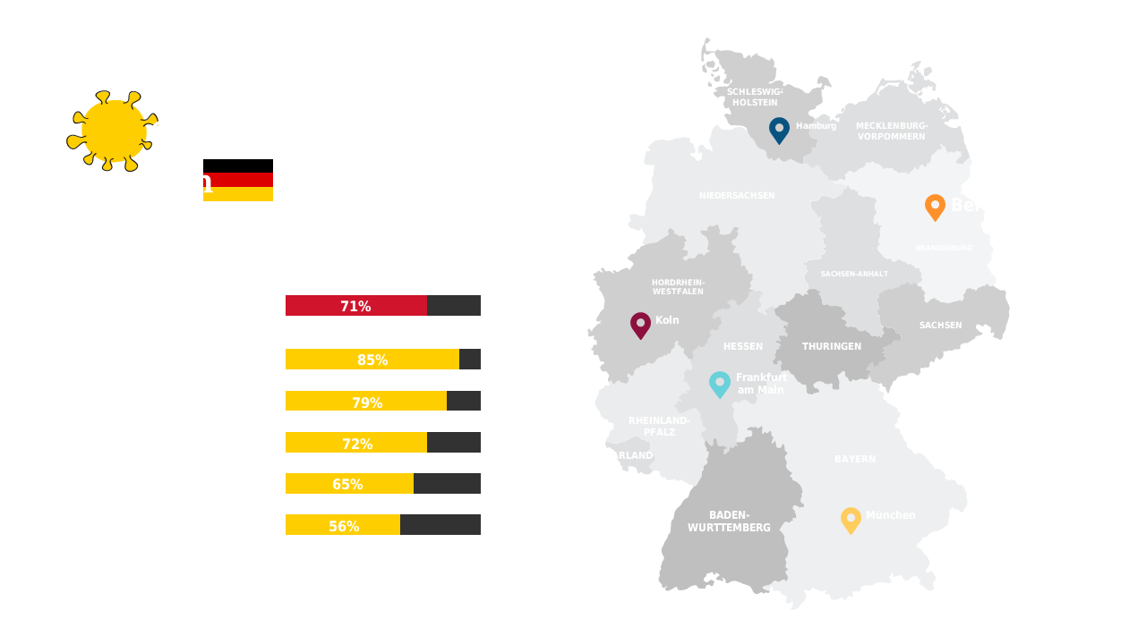
As a data analyst, you often face the challenge of making complex information easily digestible. This slide simplifies that task by combining a regional map of Germany with percentage bar graphs that clearly showcase statistical data for different areas. Each element is designed to highlight key insights, making your presentation stand out and resonate with your audience. For a business analyst, this slide is perfect for evaluating regional performance metrics. You can quickly illustrate trends and comparisons that inform your strategic decisions. If you’re a BI developer, this visual tool helps effectively communicate data findings to stakeholders, ensuring everyone is on the same page. Customization options are available, allowing you to adjust colors and data points to fit your brand’s style and the specifics of your data. $0.99 — add this single slide to any deck from the SlideSwift Slide Library. No subscription needed. Mix slides from any category to build your perfect deck.
Add more from this category to your custom deck