SlideSwift
By Category
💼Business 📊Infographics □Minimal 🕐Timelines ✨Neumorphic 🗑Diagrams 🔄Flow Charts ✨Glassmorphism 🎨Creative 🌍Abstract 🔄Cycle Diagrams 💎Isometric 🖼Illustrations 📱Social Media 🗺MapsBy Slide Type
🚀Pitch Deck 📌Roadmap 🔍SWOT Analysis 📅Timeline 📈Gantt Chart 🏢Org Chart 📋Funnel ⚖Comparison 📄Case Study 📋Agenda ⭐Icons & Lists 👏Thank You
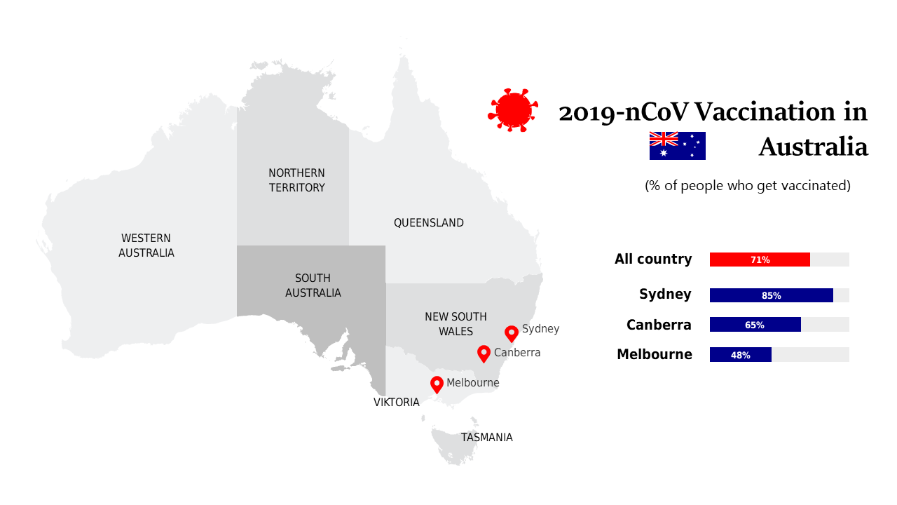
As a BI developer, you’re often tasked with presenting complex data clearly. In today’s fast-paced environment, having a visually compelling slide can make all the difference. This slide offers a detailed map of Australia, illustrating COVID-19 statistics through color-coded regions. It effectively communicates the latest trends and regional impacts at a glance, making it ideal for any audience. For finance leads, this slide is essential in discussions about budget allocations for healthcare initiatives, providing a visual representation of where funding is most needed. Data analysts can leverage this slide to support their findings, showcasing the correlation between policy changes and infection rates. Customization is straightforward; you can easily update the map details, colors, and data points to reflect the most current information. This slide is not just a visual; it’s a tool to drive impactful conversations and decisions. $0.99 — add this single slide to any deck from the SlideSwift Slide Library. No subscription needed. Mix slides from any category to build your perfect deck.
Add more from this category to your custom deck