SlideSwift
By Category
💼Business 📊Infographics □Minimal 🕐Timelines ✨Neumorphic 🗑Diagrams 🔄Flow Charts ✨Glassmorphism 🎨Creative 🌍Abstract 🔄Cycle Diagrams 💎Isometric 🖼Illustrations 📱Social Media 🗺MapsBy Slide Type
🚀Pitch Deck 📌Roadmap 🔍SWOT Analysis 📅Timeline 📈Gantt Chart 🏢Org Chart 📋Funnel ⚖Comparison 📄Case Study 📋Agenda ⭐Icons & Lists 👏Thank You
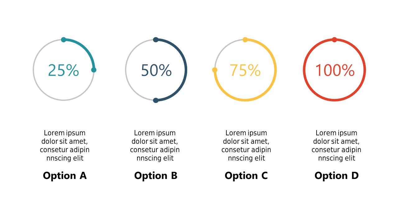
In today’s fast-paced work environment, data analysts need to convey information quickly and clearly. The challenge often lies in making complex data relatable and engaging for stakeholders. This slide showcases circular percentage indicators that visually represent completion rates and progress metrics, making it easy to grasp the status of any project or analysis at a glance. With a clean design, these indicators can be customized to display any value you need, accompanied by clear labeling for immediate understanding. A data analyst can use this slide to present project milestones, giving a visual cue to stakeholders about progress made. A business analyst might utilize it to illustrate customer feedback results, helping teams understand how well they are meeting expectations. Meanwhile, a BI developer can leverage this slide to report on data integration success rates, turning numbers into a compelling visual story. Customizing the circles is straightforward, allowing you to tailor the indicators to your specific needs. $0.99 — add this single slide to any deck from the SlideSwift Slide Library. No subscription needed. Mix slides from any category to build your perfect deck.
Add more from this category to your custom deck