SlideSwift
By Category
💼Business 📊Infographics □Minimal 🕐Timelines ✨Neumorphic 🗑Diagrams 🔄Flow Charts ✨Glassmorphism 🎨Creative 🌍Abstract 🔄Cycle Diagrams 💎Isometric 🖼Illustrations 📱Social Media 🗺MapsBy Slide Type
🚀Pitch Deck 📌Roadmap 🔍SWOT Analysis 📅Timeline 📈Gantt Chart 🏢Org Chart 📋Funnel ⚖Comparison 📄Case Study 📋Agenda ⭐Icons & Lists 👏Thank You
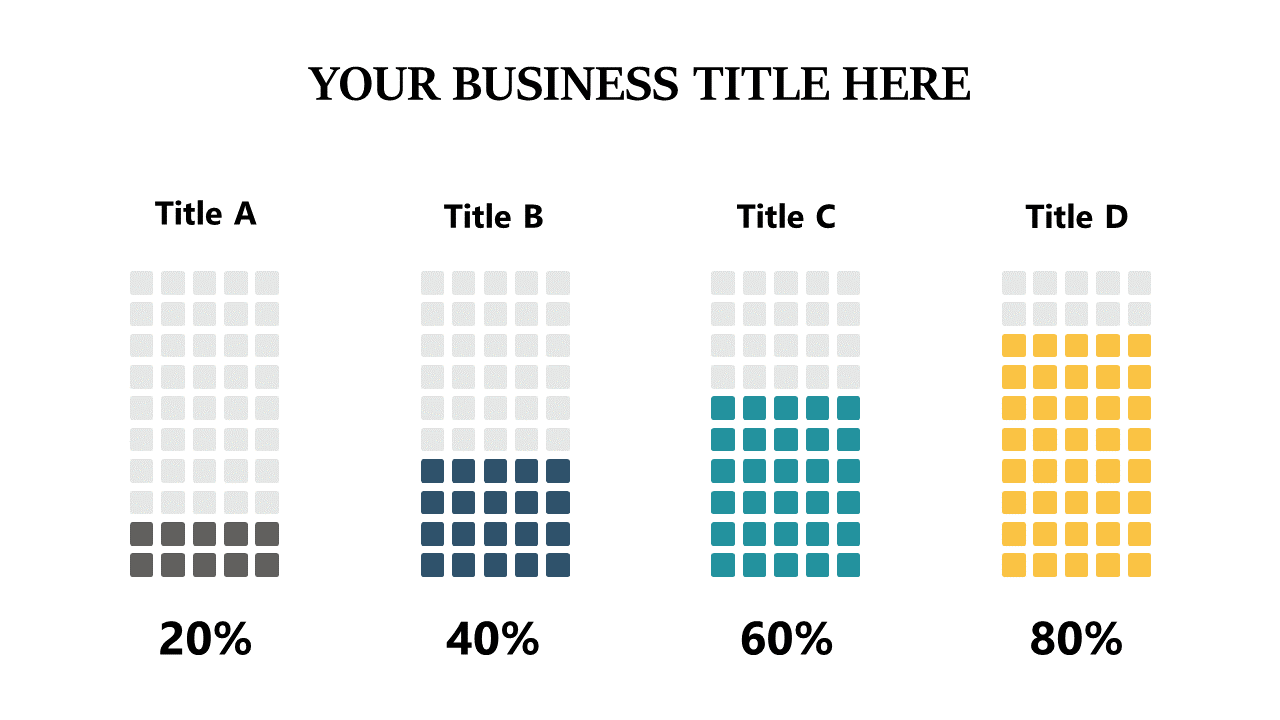
Sorting through data can be overwhelming, especially when you need to communicate insights quickly to stakeholders. A clear visual representation helps distill complex information into understandable segments. This slide showcases stacked bar charts, effectively illustrating data percentages with filled blocks that highlight comparisons. The design is clean and straightforward, ensuring your audience grasps the information at a glance. For business analysts, this slide will make your findings stand out during presentations, enabling you to communicate essential trends effortlessly. BI developers can leverage this visual to synthesize multiple data sources, facilitating better decision-making for clients. Finance leads can use this slide to present budget allocations or financial performance metrics, making it easier to convey key insights to their teams. With its fully editable format, you can customize titles and colors to align with your brand. $0.99 — add this single slide to any deck from the SlideSwift Slide Library. No subscription needed. Mix slides from any category to build your perfect deck.
Add more from this category to your custom deck