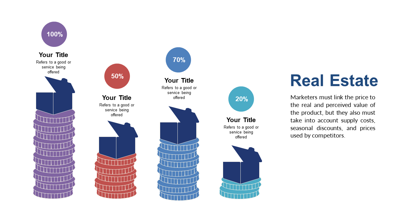
In today’s data-driven world, business analysts often face the challenge of communicating complex information in a digestible format. A well-designed visual can make all the difference in capturing attention and facilitating understanding. This slide showcases stacked bar charts that vividly represent different percentages, making it easy for your audience to grasp key insights at a glance. The icons enhance the data, adding context and clarity without overwhelming your message. As a business analyst, you can use this slide to present engagement metrics or survey results, clearly displaying trends and comparisons that drive decisions. BI developers can leverage this slide to illustrate performance metrics or user engagement over time, making data storytelling compelling and straightforward. Finance leads can utilize it to represent budget allocations or revenue streams, ensuring that financial information is presented in a way that is easy to follow and impactful. You’ll find that customization is simple, allowing you to tailor colors and icons to fit your brand. $0.99 — add this single slide to any deck from the SlideSwift Slide Library. No subscription needed. Mix slides from any category to build your perfect deck.
 SlideSwift