SlideSwift
By Category
💼Business 📊Infographics □Minimal 🕐Timelines ✨Neumorphic 🗑Diagrams 🔄Flow Charts ✨Glassmorphism 🎨Creative 🌍Abstract 🔄Cycle Diagrams 💎Isometric 🖼Illustrations 📱Social Media 🗺MapsBy Slide Type
🚀Pitch Deck 📌Roadmap 🔍SWOT Analysis 📅Timeline 📈Gantt Chart 🏢Org Chart 📋Funnel ⚖Comparison 📄Case Study 📋Agenda ⭐Icons & Lists 👏Thank You
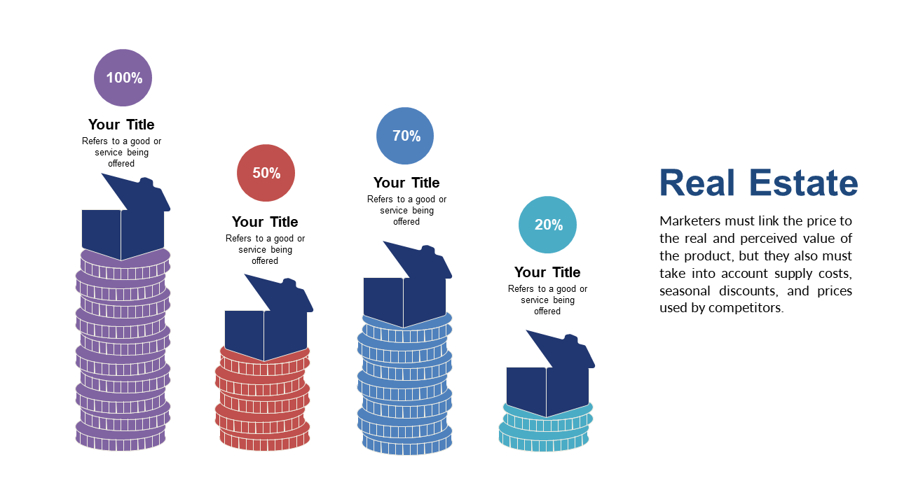
When you need to convey complex data in a straightforward way, it can be challenging to find the right visual representation. This slide showcases stacked percentage bars that clearly delineate different data segments, making it easy for your audience to grasp key insights at a glance. Enhanced with icons to illustrate the data effectively, this slide is perfect for anyone who wants to transform numbers into a visual narrative. A data analyst can use this slide to present engagement metrics from social media campaigns, helping stakeholders understand performance at a glance. A business analyst may find it useful to compare sales data across different regions, providing clear insights that drive strategic decisions. Meanwhile, a BI developer can leverage this visual to highlight trends and patterns in data analysis reports, making complex information accessible. You can easily customize the colors and icons to match your branding or data theme. $0.99 — add this single slide to any deck from the SlideSwift Slide Library. No subscription needed. Mix slides from any category to build your perfect deck.
Add more from this category to your custom deck