SlideSwift
By Category
💼Business 📊Infographics □Minimal 🕐Timelines ✨Neumorphic 🗑Diagrams 🔄Flow Charts ✨Glassmorphism 🎨Creative 🌍Abstract 🔄Cycle Diagrams 💎Isometric 🖼Illustrations 📱Social Media 🗺MapsBy Slide Type
🚀Pitch Deck 📌Roadmap 🔍SWOT Analysis 📅Timeline 📈Gantt Chart 🏢Org Chart 📋Funnel ⚖Comparison 📄Case Study 📋Agenda ⭐Icons & Lists 👏Thank You
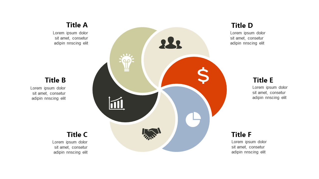
When presenting data, clarity is key. You need a way to illustrate the differences between current and future performance metrics without overwhelming your audience. This slide offers a clean visual layout that uses hexagonal shapes to succinctly compare key performance indicators (KPIs). With its intuitive design, you can easily convey the shifts in metrics that matter most to your stakeholders. A performance manager will find this slide invaluable for demonstrating progress towards strategic goals, allowing them to clearly show how initiatives impact overall performance. For an operations manager, it serves as a powerful tool for illustrating changes in processes or efficiency metrics, making it clear where improvements lead to value creation. Similarly, a finance lead can utilize this slide to present financial forecasts versus actuals, effectively communicating the implications of budgetary decisions.
Customization is straightforward, allowing you to adjust colors and text to fit your brand.
$0.99 —
add this single slide to any deck from the SlideSwift Slide Library. No subscription needed. Mix slides from any category to build your perfect deck.
$0.99 – Purchase Checkout
Added to cart
Add more from this category to your custom deck