SlideSwift
By Category
💼Business 📊Infographics □Minimal 🕐Timelines ✨Neumorphic 🗑Diagrams 🔄Flow Charts ✨Glassmorphism 🎨Creative 🌍Abstract 🔄Cycle Diagrams 💎Isometric 🖼Illustrations 📱Social Media 🗺MapsBy Slide Type
🚀Pitch Deck 📌Roadmap 🔍SWOT Analysis 📅Timeline 📈Gantt Chart 🏢Org Chart 📋Funnel ⚖Comparison 📄Case Study 📋Agenda ⭐Icons & Lists 👏Thank You
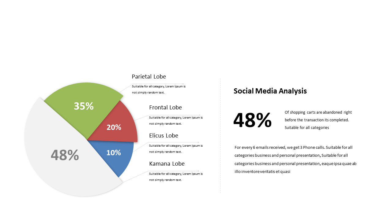
Data presentations can often feel overwhelming, especially when you’re trying to convey complex information in a clear way. A well-designed slide can make all the difference in driving your point home. This pie chart slide displays percentage segments with explanatory text, allowing you to visualize data distribution effectively. With its clean design and easy-to-understand layout, this slide lets your audience quickly grasp the insights behind the numbers.
As a data analyst, you can use this visual to demonstrate findings from your latest analysis, making intricate data sets accessible at a glance. A business analyst can leverage this slide to illustrate market trends or behaviors, ensuring stakeholders understand key insights during presentations. For BI developers, this pie chart serves as an essential tool to summarize performance metrics, simplifying complex data into actionable insights.
You can customize colors and text to align with your branding or to highlight specific data points. $0.99 — add this single slide to any deck from the SlideSwift Slide Library. No subscription needed. Mix slides from any category to build your perfect deck.
Add more from this category to your custom deck