SlideSwift
By Category
💼Business 📊Infographics □Minimal 🕐Timelines ✨Neumorphic 🗑Diagrams 🔄Flow Charts ✨Glassmorphism 🎨Creative 🌍Abstract 🔄Cycle Diagrams 💎Isometric 🖼Illustrations 📱Social Media 🗺MapsBy Slide Type
🚀Pitch Deck 📌Roadmap 🔍SWOT Analysis 📅Timeline 📈Gantt Chart 🏢Org Chart 📋Funnel ⚖Comparison 📄Case Study 📋Agenda ⭐Icons & Lists 👏Thank You
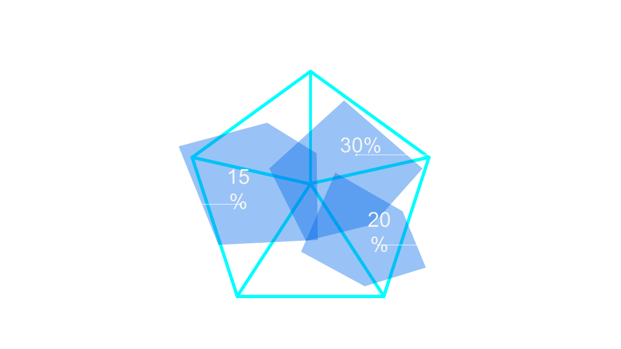
As a data analyst, you know how challenging it can be to present multiple metrics in a clear and engaging way. The Pentagon Percentage Chart offers a compelling visual with its distinct segments that highlight percentage values, making it perfect for your next presentation. Each section can be customized, allowing you to adjust colors and percentages to align with your brand’s identity. Imagine being able to quickly convey performance data in a visually striking format that captures your audience’s attention. A business analyst might use this slide to compare sales growth across different regions, showcasing key insights at a glance. Meanwhile, a BI developer could implement this chart in a dashboard presentation to illustrate data trends effectively, giving stakeholders a clear view of progress. The flexibility of this slide means you can adapt it to fit various branding styles and data needs. $0.99 — add this single slide to any deck from the SlideSwift Slide Library. No subscription needed. Mix slides from any category to build your perfect deck.
Add more from this category to your custom deck