SlideSwift
By Category
💼Business 📊Infographics □Minimal 🕐Timelines ✨Neumorphic 🗑Diagrams 🔄Flow Charts ✨Glassmorphism 🎨Creative 🌍Abstract 🔄Cycle Diagrams 💎Isometric 🖼Illustrations 📱Social Media 🗺MapsBy Slide Type
🚀Pitch Deck 📌Roadmap 🔍SWOT Analysis 📅Timeline 📈Gantt Chart 🏢Org Chart 📋Funnel ⚖Comparison 📄Case Study 📋Agenda ⭐Icons & Lists 👏Thank You
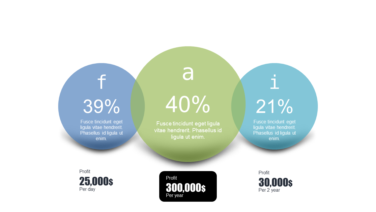
When you’re faced with complex profit data, conveying it clearly can be a challenge. This slide provides a clear, visual representation of profit distribution using circular elements to display different profit percentages alongside their corresponding values. It’s designed to simplify financial presentations and makes it easy to grasp key insights at a glance. As a data analyst, you can use this slide to showcase the profit distribution across various product lines effectively. For a business analyst, it can serve as a compelling way to highlight trends and variances in profit over time. A BI developer can leverage this slide to integrate visual data storytelling into dashboards, making the information more accessible to stakeholders. You can customize the circles to reflect your specific figures and color schemes, ensuring it aligns perfectly with your branding. $0.99 — add this single slide to any deck from the SlideSwift Slide Library. No subscription needed. Mix slides from any category to build your perfect deck.
Add more from this category to your custom deck