SlideSwift
By Category
💼Business 📊Infographics □Minimal 🕐Timelines ✨Neumorphic 🗑Diagrams 🔄Flow Charts ✨Glassmorphism 🎨Creative 🌍Abstract 🔄Cycle Diagrams 💎Isometric 🖼Illustrations 📱Social Media 🗺MapsBy Slide Type
🚀Pitch Deck 📌Roadmap 🔍SWOT Analysis 📅Timeline 📈Gantt Chart 🏢Org Chart 📋Funnel ⚖Comparison 📄Case Study 📋Agenda ⭐Icons & Lists 👏Thank You
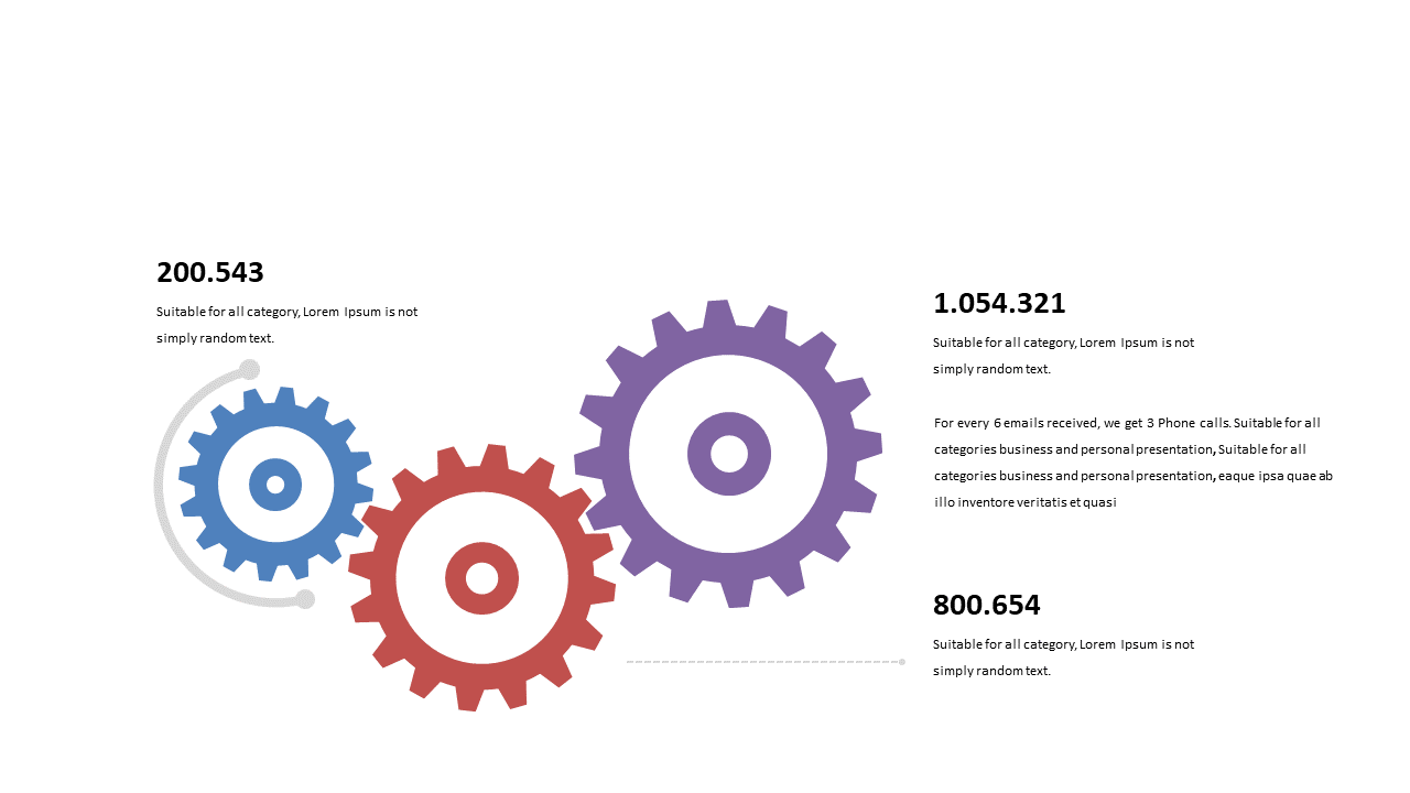
As a data analyst, you know that conveying complex metrics can be a challenge, especially when clarity is essential. This slide uses interlocking gears to represent comparative metrics in a way that is both visually engaging and easy to understand. The design draws attention to the relationships between different data points, making your analysis stand out. For a business analyst, this slide can serve as a powerful tool to illustrate performance data and trends in client meetings. It allows you to present findings in a way that is not only informative but also memorable. A BI developer can utilize this slide to visualize data transformations and workflows, effectively communicating technical processes to stakeholders. Customization is straightforward, allowing you to adjust colors and labels to fit your brand. This means you can tailor the slide to meet your specific needs and audience expectations. $0.99 — add this single slide to any deck from the SlideSwift Slide Library. No subscription needed. Mix slides from any category to build your perfect deck.
Add more from this category to your custom deck