SlideSwift
By Category
💼Business 📊Infographics □Minimal 🕐Timelines ✨Neumorphic 🗑Diagrams 🔄Flow Charts ✨Glassmorphism 🎨Creative 🌍Abstract 🔄Cycle Diagrams 💎Isometric 🖼Illustrations 📱Social Media 🗺MapsBy Slide Type
🚀Pitch Deck 📌Roadmap 🔍SWOT Analysis 📅Timeline 📈Gantt Chart 🏢Org Chart 📋Funnel ⚖Comparison 📄Case Study 📋Agenda ⭐Icons & Lists 👏Thank You
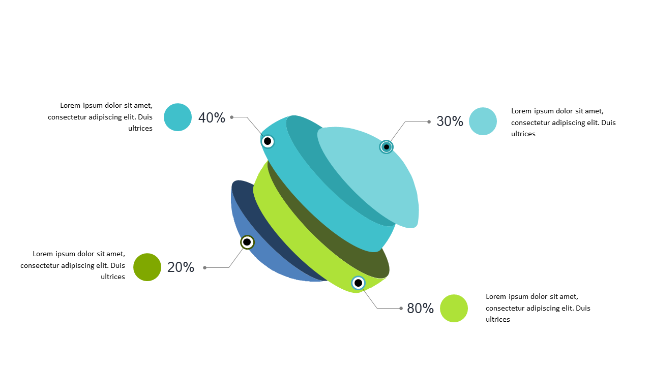
You know the struggle of making data engaging—so much information and so little time to present it effectively. This 3D circular data diagram transforms percentage distributions into a visually compelling format that captures attention and simplifies complex information. Imagine showcasing your latest social media engagement metrics with a design that not only looks great but also makes the data easier to digest. This slide is perfect for illustrating key insights in a way that keeps your audience engaged from start to finish. As a data analyst, you can quickly edit the percentage values and accompanying text to suit your specific findings. A business analyst could use it to highlight trends in customer behavior, while a BI developer might leverage the design to present insights from multiple data sources. Customizing the colors and text is straightforward, allowing you to align it with your brand. $0.99 — add this single slide to any deck from the SlideSwift Slide Library. No subscription needed. Mix slides from any category to build your perfect deck.
Add more from this category to your custom deck