SlideSwift
By Category
💼Business 📊Infographics □Minimal 🕐Timelines ✨Neumorphic 🗑Diagrams 🔄Flow Charts ✨Glassmorphism 🎨Creative 🌍Abstract 🔄Cycle Diagrams 💎Isometric 🖼Illustrations 📱Social Media 🗺MapsBy Slide Type
🚀Pitch Deck 📌Roadmap 🔍SWOT Analysis 📅Timeline 📈Gantt Chart 🏢Org Chart 📋Funnel ⚖Comparison 📄Case Study 📋Agenda ⭐Icons & Lists 👏Thank You
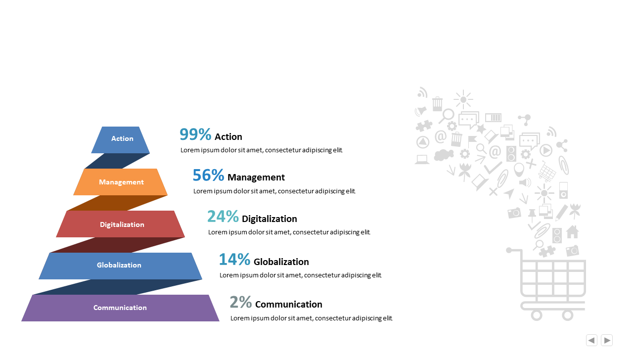
Finding the right way to present complex data can be challenging, especially when trying to convey relationships between different categories. This slide provides a pyramid chart that clearly displays a percentage distribution across various categories, including Action, Management, Digitalization, Globalization, and Communication. Visually, it offers a clean and professional layout that makes hierarchical data easy to understand at a glance. A BI developer can use this slide to present insights on organizational priorities, helping stakeholders grasp the significance of each segment quickly. For a finance lead, this chart can be an effective tool to highlight financial performance across different areas, showcasing where to focus resources. Meanwhile, a data analyst can utilize this slide to break down complex datasets, making it easier for audiences to digest the information. Customization is simple; you can easily adapt colors and labels to fit your specific data. $0.99 — add this single slide to any deck from the SlideSwift Slide Library. No subscription needed. Mix slides from any category to build your perfect deck.
Add more from this category to your custom deck