SlideSwift
By Category
💼Business 📊Infographics □Minimal 🕐Timelines ✨Neumorphic 🗑Diagrams 🔄Flow Charts ✨Glassmorphism 🎨Creative 🌍Abstract 🔄Cycle Diagrams 💎Isometric 🖼Illustrations 📱Social Media 🗺MapsBy Slide Type
🚀Pitch Deck 📌Roadmap 🔍SWOT Analysis 📅Timeline 📈Gantt Chart 🏢Org Chart 📋Funnel ⚖Comparison 📄Case Study 📋Agenda ⭐Icons & Lists 👏Thank You
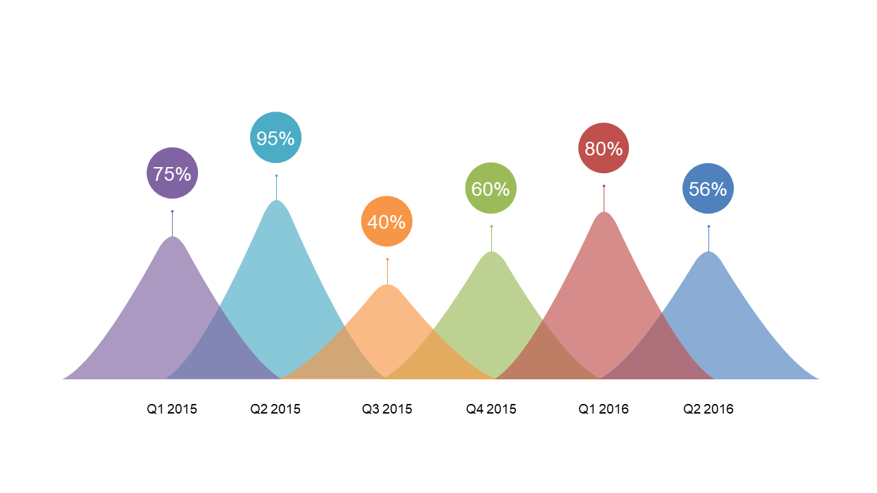
In today’s fast-paced work environment, data analysts often face the challenge of presenting complex information in a way that’s easily digestible. This slide showcases multi-year performance peaks, allowing you to visualize variations in data over time. With a clean and captivating design, it highlights key metrics through a series of peaks, making comparisons straightforward and impactful.
A data analyst can use this slide to illustrate quarterly performance trends during a team meeting, ensuring everyone understands how strategies have evolved. Meanwhile, a business analyst may leverage it to present insights to stakeholders, emphasizing the importance of long-term trends in decision-making. For a BI developer, this slide provides a perfect visual to complement reports, making the data not only informative but also engaging. Customizing this slide is simple; you can easily edit the metrics to fit your specific data needs.
$0.99 — add this single slide to any deck from the SlideSwift Slide Library. No subscription needed. Mix slides from any category to build your perfect deck.
Add more from this category to your custom deck