SlideSwift
By Category
💼Business 📊Infographics □Minimal 🕐Timelines ✨Neumorphic 🗑Diagrams 🔄Flow Charts ✨Glassmorphism 🎨Creative 🌍Abstract 🔄Cycle Diagrams 💎Isometric 🖼Illustrations 📱Social Media 🗺MapsBy Slide Type
🚀Pitch Deck 📌Roadmap 🔍SWOT Analysis 📅Timeline 📈Gantt Chart 🏢Org Chart 📋Funnel ⚖Comparison 📄Case Study 📋Agenda ⭐Icons & Lists 👏Thank You
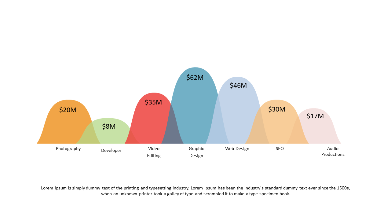
When you’re managing financial data, clarity is crucial. Presenting complex numbers can often leave your audience lost, but this colored wave chart slide makes it easy to visualize financial distributions across various industries. The vibrant wave shapes distinctly represent different metrics, allowing your audience to grasp key insights at a glance. For a finance lead, this slide is perfect for summarizing quarterly reports or illustrating budget allocations. A data analyst can utilize it to showcase trends over time, making data-driven conversations more impactful. Meanwhile, a business analyst can employ this slide to compare industry performance, bringing clarity to competitive analyses. Customization is straightforward—adjust colors or labels to align with your branding or specific data sets. $0.99 — add this single slide to any deck from the SlideSwift Slide Library. No subscription needed. Mix slides from any category to build your perfect deck. Fully compatible with Microsoft PowerPoint and Google Slides — swap colors, fonts, icons, and text in minutes to match your brand guidelines or corporate deck theme without any design experience.
Add more from this category to your custom deck