SlideSwift
By Category
💼Business 📊Infographics □Minimal 🕐Timelines ✨Neumorphic 🗑Diagrams 🔄Flow Charts ✨Glassmorphism 🎨Creative 🌍Abstract 🔄Cycle Diagrams 💎Isometric 🖼Illustrations 📱Social Media 🗺MapsBy Slide Type
🚀Pitch Deck 📌Roadmap 🔍SWOT Analysis 📅Timeline 📈Gantt Chart 🏢Org Chart 📋Funnel ⚖Comparison 📄Case Study 📋Agenda ⭐Icons & Lists 👏Thank You
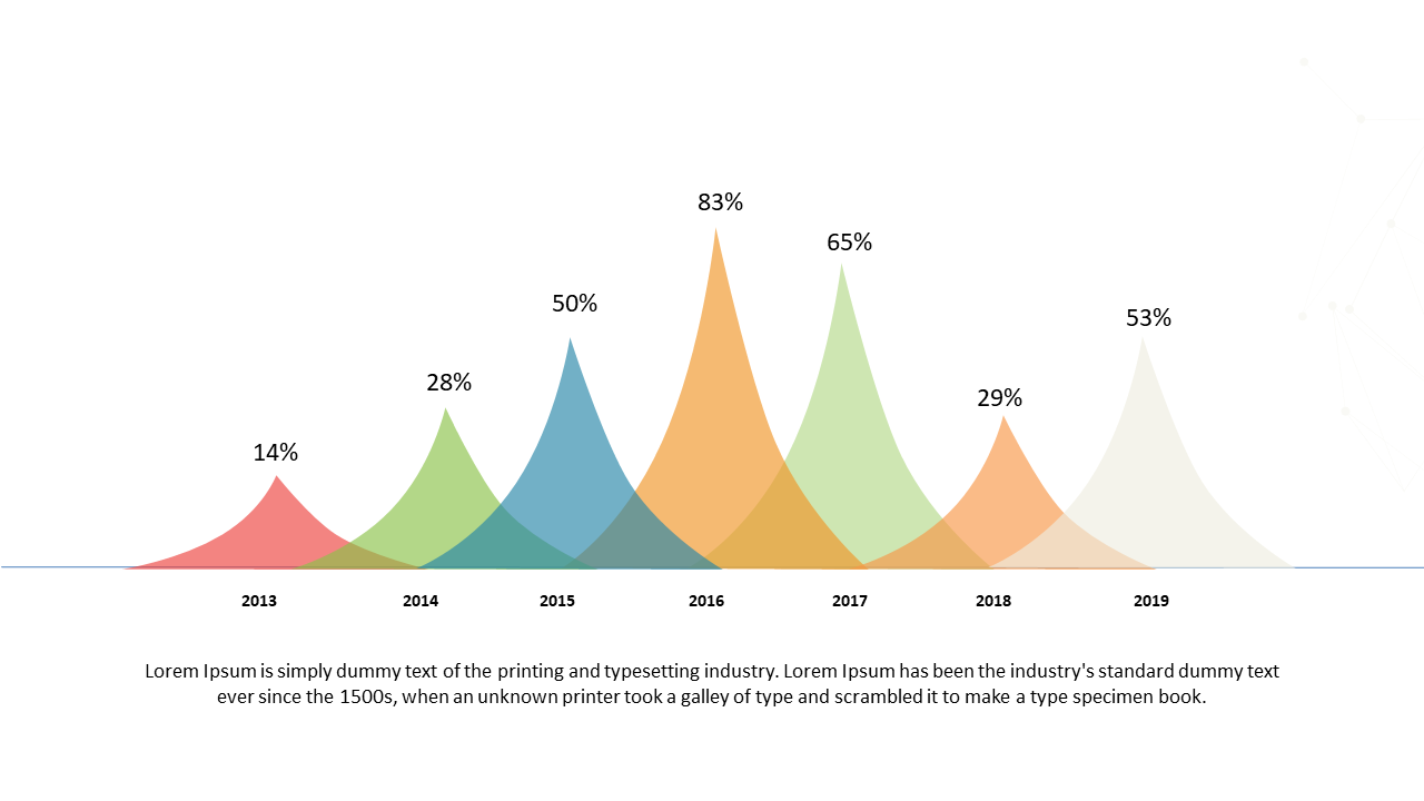
Are you struggling to convey complex data trends in your presentations? This slide offers a vibrant bell curve design that simplifies your message and helps your audience grasp important insights quickly. The colorful gradient is both eye-catching and informative, allowing your data to shine. As a business analyst, you can use this slide to illustrate changes in social media engagement metrics over time, making it easier for stakeholders to understand performance indicators. A BI developer could leverage this bell curve to compare historical data against current metrics, providing clear visual context for decision-making. Meanwhile, a finance lead can present financial forecasts and variances, ensuring that critical insights are not lost in the numbers. The slide’s colors can be easily customized to align with your branding or theme. $0.99 — add this single slide to any deck from the SlideSwift Slide Library. No subscription needed. Mix slides from any category to build your perfect deck.
Add more from this category to your custom deck