SlideSwift
By Category
💼Business 📊Infographics □Minimal 🕐Timelines ✨Neumorphic 🗑Diagrams 🔄Flow Charts ✨Glassmorphism 🎨Creative 🌍Abstract 🔄Cycle Diagrams 💎Isometric 🖼Illustrations 📱Social Media 🗺MapsBy Slide Type
🚀Pitch Deck 📌Roadmap 🔍SWOT Analysis 📅Timeline 📈Gantt Chart 🏢Org Chart 📋Funnel ⚖Comparison 📄Case Study 📋Agenda ⭐Icons & Lists 👏Thank You
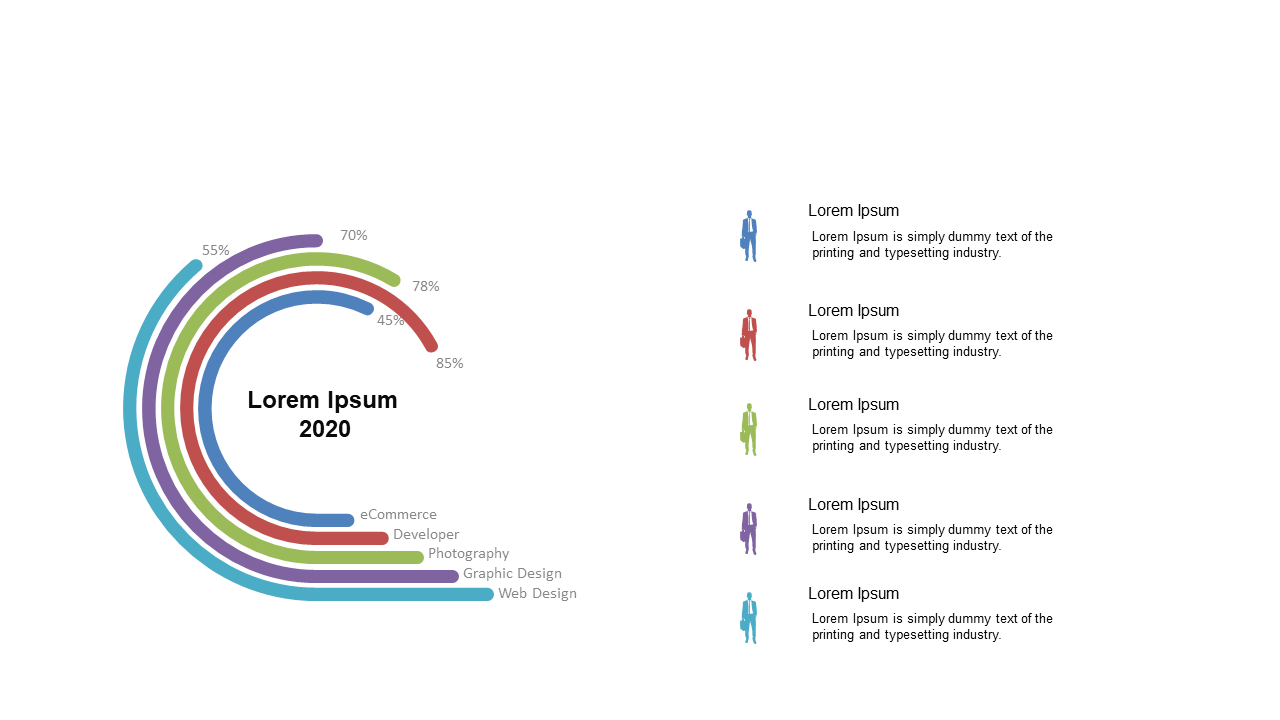
Presenting data in a clear and engaging way can often feel overwhelming, especially when trying to capture attention in a crowded meeting. This radial progress circle provides an effective visual representation of percentage data, allowing your audience to grasp important metrics at a glance. With category labels integrated into the design, it seamlessly aligns with any report or presentation. For business analysts, this slide is perfect for illustrating key performance indicators, making complex data digestible for stakeholders. BI developers will appreciate its clarity when showcasing data trends and forecasts, allowing for concise storytelling through visuals. Finance leads can use this slide to compare budget allocations against actual expenditures, making financial reviews not only informative but visually compelling. The design is customizable, so feel free to adjust colors and labels to match your branding.
$0.99 —
add this single slide to any deck from the SlideSwift Slide Library. No subscription needed. Mix slides from any category to build your perfect deck.
$0.99 – Purchase Checkout
Added to cart
Add more from this category to your custom deck