SlideSwift
By Category
💼Business 📊Infographics □Minimal 🕐Timelines ✨Neumorphic 🗑Diagrams 🔄Flow Charts ✨Glassmorphism 🎨Creative 🌍Abstract 🔄Cycle Diagrams 💎Isometric 🖼Illustrations 📱Social Media 🗺MapsBy Slide Type
🚀Pitch Deck 📌Roadmap 🔍SWOT Analysis 📅Timeline 📈Gantt Chart 🏢Org Chart 📋Funnel ⚖Comparison 📄Case Study 📋Agenda ⭐Icons & Lists 👏Thank You
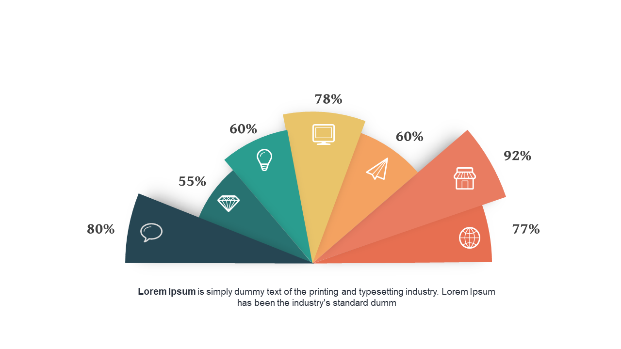
When you’re tasked with presenting comparative data, clarity is key. You need visuals that not only convey information but also engage your audience. This slide offers a semi-circular design divided into segments, each showcasing percentage indicators for easy understanding. It’s perfect for displaying survey results or performance metrics that require a quick visual comparison.
As a data analyst, you can use this slide to break down complex datasets into digestible visual pieces, making your analysis easier for your audience to grasp. A business analyst might find it invaluable for summarizing findings from market research or customer feedback, presenting insights in a compelling manner. For a BI developer, integrating this slide into reports can enhance the visual appeal of dashboards, making key metrics stand out.
Customization is straightforward; simply edit the colors to align with your branding or presentation theme. $0.99 — add this single slide to any deck from the SlideSwift Slide Library. No subscription needed. Mix slides from any category to build your perfect deck.
Add more from this category to your custom deck