SlideSwift
By Category
💼Business 📊Infographics □Minimal 🕐Timelines ✨Neumorphic 🗑Diagrams 🔄Flow Charts ✨Glassmorphism 🎨Creative 🌍Abstract 🔄Cycle Diagrams 💎Isometric 🖼Illustrations 📱Social Media 🗺MapsBy Slide Type
🚀Pitch Deck 📌Roadmap 🔍SWOT Analysis 📅Timeline 📈Gantt Chart 🏢Org Chart 📋Funnel ⚖Comparison 📄Case Study 📋Agenda ⭐Icons & Lists 👏Thank You
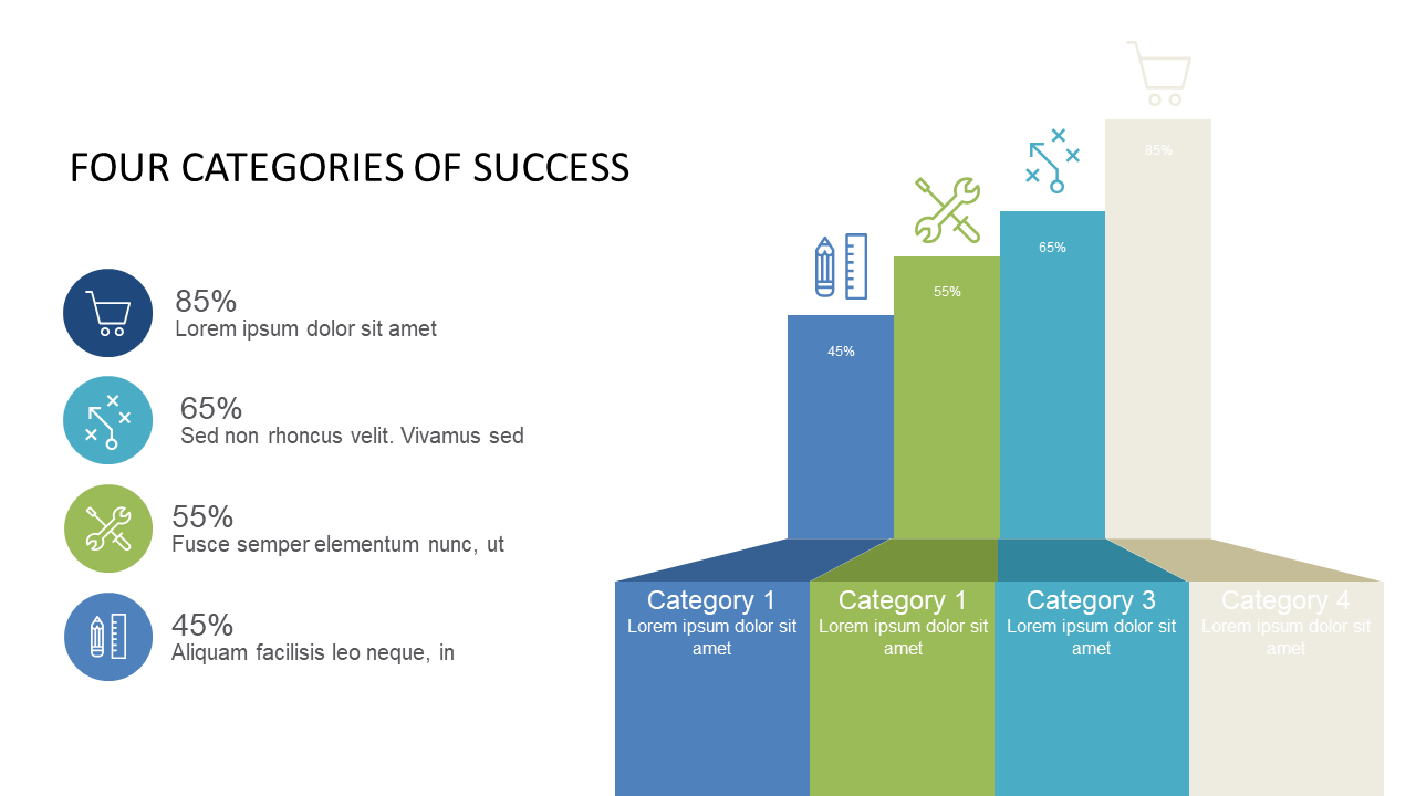
When you’re under pressure to present data that tells a story, finding the right way to visualize success can be a challenge. This slide showcases a step column chart that highlights four distinct categories of success, each represented by a unique bar with corresponding percentage values. It provides an immediate visual impact that makes comparisons straightforward and easy to understand. As a business analyst, you can use this to present quarterly performance metrics, making the data accessible at a glance. For a BI developer, this chart is perfect for integrating into dashboards that require quick insights into key performance indicators. A finance lead can utilize this slide to illustrate budget allocations and their effectiveness across different projects. Customizing the colors and labels is simple, allowing you to tailor the slide to fit your brand’s style or the specific context of your presentation. $0.99 — add this single slide to any deck from the SlideSwift Slide Library. No subscription needed. Mix slides from any category to build your perfect deck.
Add more from this category to your custom deck