SlideSwift
By Category
💼Business 📊Infographics □Minimal 🕐Timelines ✨Neumorphic 🗑Diagrams 🔄Flow Charts ✨Glassmorphism 🎨Creative 🌍Abstract 🔄Cycle Diagrams 💎Isometric 🖼Illustrations 📱Social Media 🗺MapsBy Slide Type
🚀Pitch Deck 📌Roadmap 🔍SWOT Analysis 📅Timeline 📈Gantt Chart 🏢Org Chart 📋Funnel ⚖Comparison 📄Case Study 📋Agenda ⭐Icons & Lists 👏Thank You
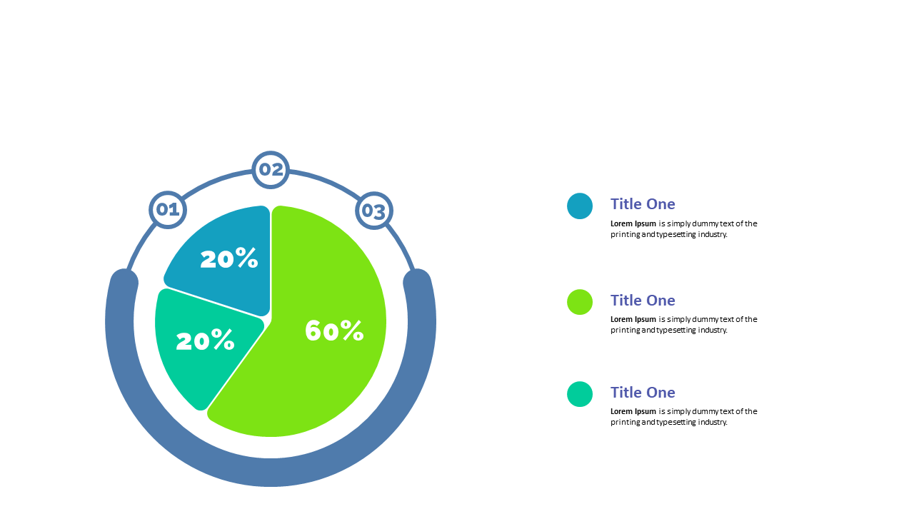
When you’re tasked with presenting complex metrics, a clear visual can make all the difference. This circular percentage chart allows you to divide and showcase your data in a way that’s easy to understand at a glance. With distinct segments representing different values and a legend for clarity, this slide is perfect for conveying performance metrics or engagement statistics.
As a finance lead, you can use this slide to illustrate budget distribution or revenue breakdowns in your next meeting. For a data analyst, it’s an excellent way to present findings from your latest analysis clearly and attractively. Meanwhile, a business analyst can utilize this slide to highlight key insights from market research, helping stakeholders grasp critical information quickly.
Customization is simple; just edit the segments and colors to match your brand or the specific data you’re presenting. $0.99 — add this single slide to any deck from the SlideSwift Slide Library. No subscription needed. Mix slides from any category to build your perfect deck.
Add more from this category to your custom deck