SlideSwift
By Category
💼Business 📊Infographics □Minimal 🕐Timelines ✨Neumorphic 🗑Diagrams 🔄Flow Charts ✨Glassmorphism 🎨Creative 🌍Abstract 🔄Cycle Diagrams 💎Isometric 🖼Illustrations 📱Social Media 🗺MapsBy Slide Type
🚀Pitch Deck 📌Roadmap 🔍SWOT Analysis 📅Timeline 📈Gantt Chart 🏢Org Chart 📋Funnel ⚖Comparison 📄Case Study 📋Agenda ⭐Icons & Lists 👏Thank You
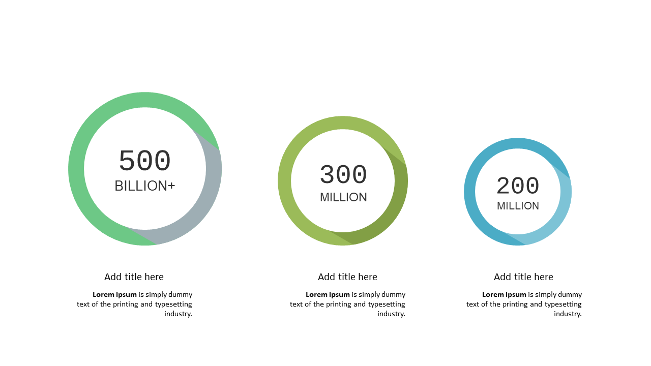
When you need to present complex metrics, clarity is key. This circular data comparison layout visually simplifies data, making it easier for your audience to grasp essential information. The design incorporates circular segments that represent different data points, allowing you to compare metrics at a glance. The layout is sleek and modern, enhancing the overall professionalism of your PowerPoint presentation. As a BI developer, you can seamlessly integrate this slide to visualize performance metrics and trends, providing valuable insights to stakeholders. For a finance lead, this slide can illustrate budget comparisons, making financial data more digestible during meetings. Data analysts can leverage this layout to showcase survey results or other quantitative analyses, turning raw data into meaningful visual narratives. With easy customization options, you can adjust colors and text to fit your branding.
$0.99 —
add this single slide to any deck from the SlideSwift Slide Library. No subscription needed. Mix slides from any category to build your perfect deck.
$0.99 – Purchase Checkout
Added to cart
Add more from this category to your custom deck