SlideSwift
By Category
💼Business 📊Infographics □Minimal 🕐Timelines ✨Neumorphic 🗑Diagrams 🔄Flow Charts ✨Glassmorphism 🎨Creative 🌍Abstract 🔄Cycle Diagrams 💎Isometric 🖼Illustrations 📱Social Media 🗺MapsBy Slide Type
🚀Pitch Deck 📌Roadmap 🔍SWOT Analysis 📅Timeline 📈Gantt Chart 🏢Org Chart 📋Funnel ⚖Comparison 📄Case Study 📋Agenda ⭐Icons & Lists 👏Thank You
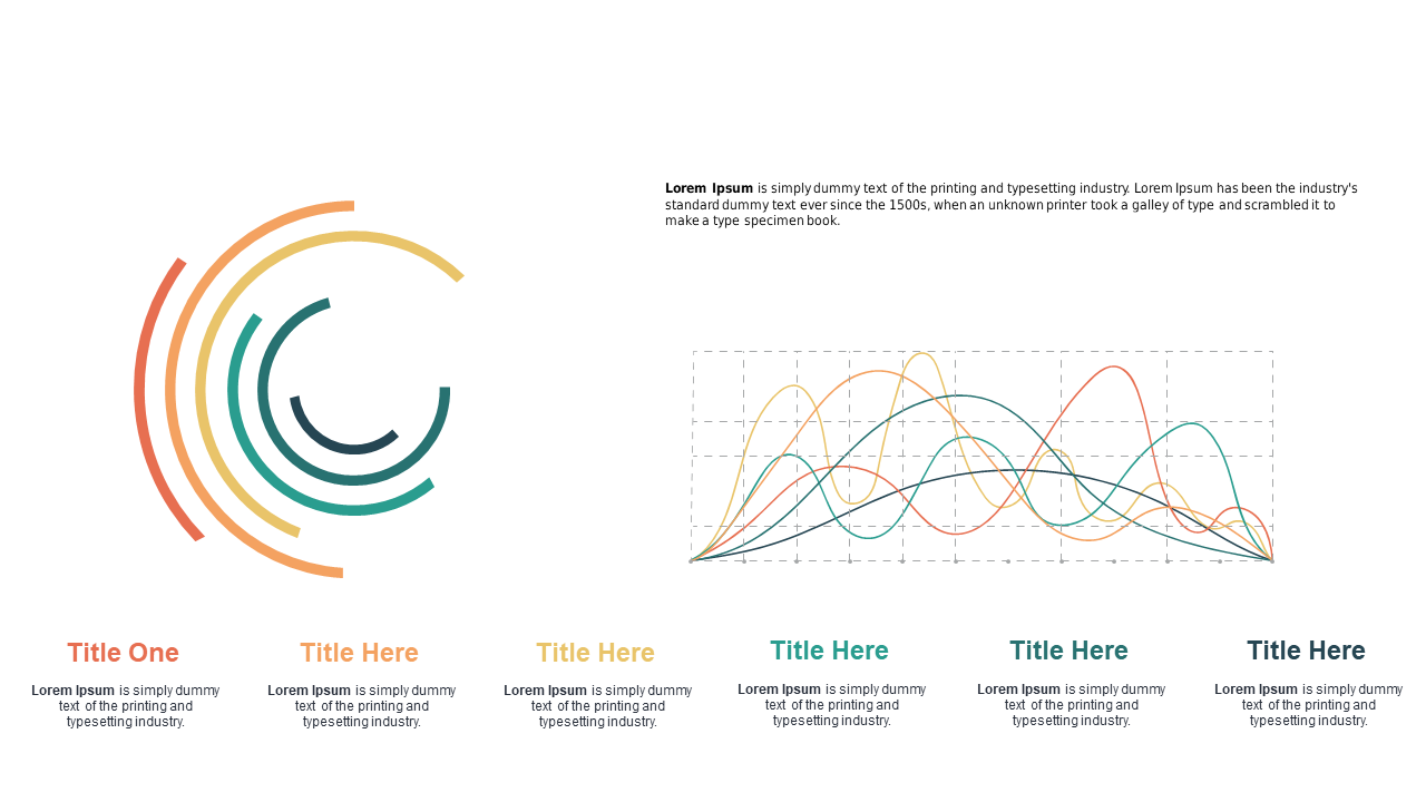
Finding a clear way to present data can be a challenge, especially when dealing with multiple trends. This slide’s circular multi-line graph design allows you to effectively compare various metrics in a visually engaging manner. You’ll appreciate the clean lines and vibrant colors that help highlight the differences in trends over time. For a BI developer, this slide is perfect for showcasing performance analytics to stakeholders, making complex data understandable at a glance. A finance lead can use this slide to present revenue trends against market fluctuations, providing vital insights for strategic planning. Meanwhile, a data analyst may find this slide invaluable for reporting on customer engagement metrics, making it easier to pinpoint areas for improvement.
Customization is straightforward, allowing you to adjust colors and titles to fit your branding.
$0.99 —
add this single slide to any deck from the SlideSwift Slide Library. No subscription needed. Mix slides from any category to build your perfect deck.
$0.99 – Purchase Checkout
Added to cart
Add more from this category to your custom deck