SlideSwift
By Category
💼Business 📊Infographics □Minimal 🕐Timelines ✨Neumorphic 🗑Diagrams 🔄Flow Charts ✨Glassmorphism 🎨Creative 🌍Abstract 🔄Cycle Diagrams 💎Isometric 🖼Illustrations 📱Social Media 🗺MapsBy Slide Type
🚀Pitch Deck 📌Roadmap 🔍SWOT Analysis 📅Timeline 📈Gantt Chart 🏢Org Chart 📋Funnel ⚖Comparison 📄Case Study 📋Agenda ⭐Icons & Lists 👏Thank You
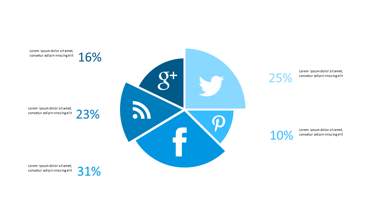
In today’s fast-paced work environment, presenting data clearly is essential for decision-making. Often, you need to convey complex information quickly, and a pie chart is an effective way to visualize data distribution at a glance. This slide displays a pie chart divided into segments, each representing various percentages, allowing viewers to easily grasp the overall trends and distributions. Imagine using this slide in your next presentation to illustrate market shares or social media platform usage. A BI developer can utilize this to highlight key performance indicators to stakeholders, making the data more relatable and actionable. Meanwhile, a finance lead might find it useful to present budget allocations or revenue streams, ensuring clarity during financial discussions. A data analyst can leverage this slide to showcase survey results, helping teams understand preferences or trends. You can easily customize colors and labels to suit your branding. $0.99 — add this single slide to any deck from the SlideSwift Slide Library. No subscription needed. Mix slides from any category to build your perfect deck.
Add more from this category to your custom deck