SlideSwift
By Category
💼Business 📊Infographics □Minimal 🕐Timelines ✨Neumorphic 🗑Diagrams 🔄Flow Charts ✨Glassmorphism 🎨Creative 🌍Abstract 🔄Cycle Diagrams 💎Isometric 🖼Illustrations 📱Social Media 🗺MapsBy Slide Type
🚀Pitch Deck 📌Roadmap 🔍SWOT Analysis 📅Timeline 📈Gantt Chart 🏢Org Chart 📋Funnel ⚖Comparison 📄Case Study 📋Agenda ⭐Icons & Lists 👏Thank You
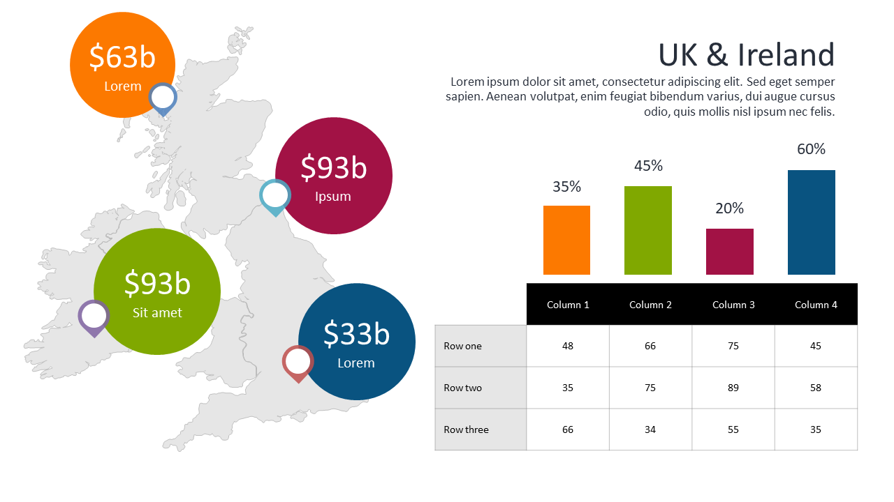
When tasked with presenting complex financial data, data analysts often struggle to convey insights clearly. This slide solves that problem by combining circular and bar charts, allowing for easy comparison of crucial financial metrics. Visually, you’ll see circular data points that depict significant figures alongside a bar chart, providing a clear and engaging representation of your data. A data analyst can use this slide to present quarterly earnings versus last year’s performance, making the data easily digestible for stakeholders. Meanwhile, a business analyst might employ it to showcase budget allocation changes over time, highlighting trends that demand attention. A BI developer could utilize this layout to illustrate the impact of marketing strategies on revenue, making it easier for the team to strategize effectively. The slide is fully customizable, so you can input your own data points and branding. $0.99 — add this single slide to any deck from the SlideSwift Slide Library. No subscription needed. Mix slides from any category to build your perfect deck.
Add more from this category to your custom deck