Showing 365 slides
in Data Visualization

View full slide →
✓
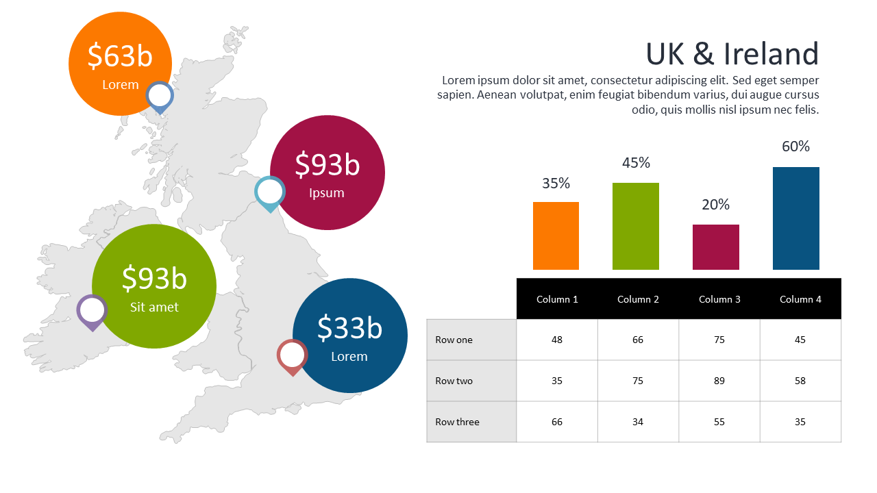
Highlight key financial figures with circular indicators and bar charts.
View full slide →
✓
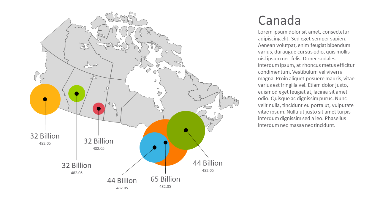
Visualize data distribution across regions using this editable map layout.
View full slide →
✓
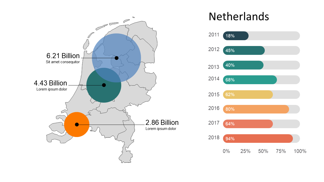
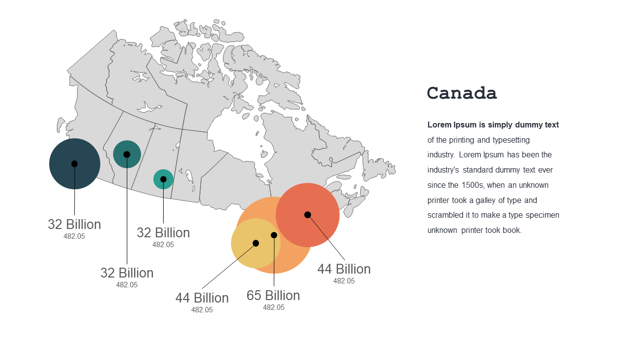
Visualize metrics effectively using geographic data with circles and bar charts.
View full slide →
✓
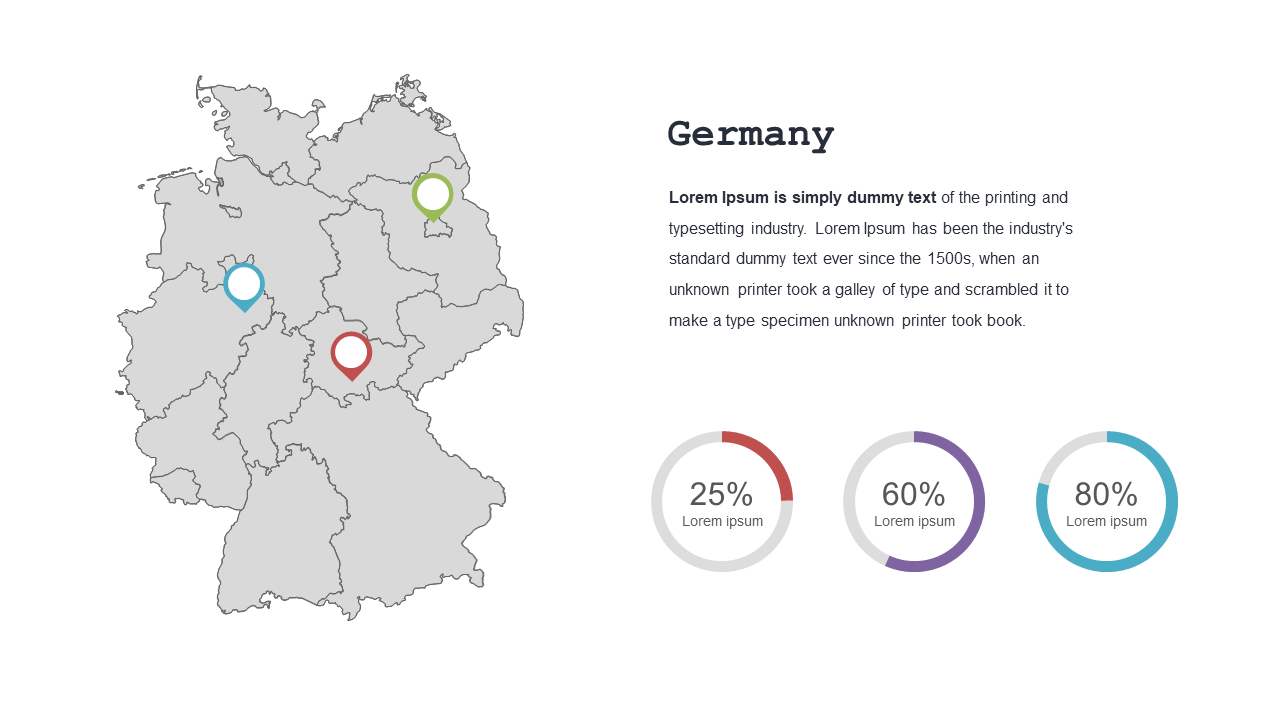
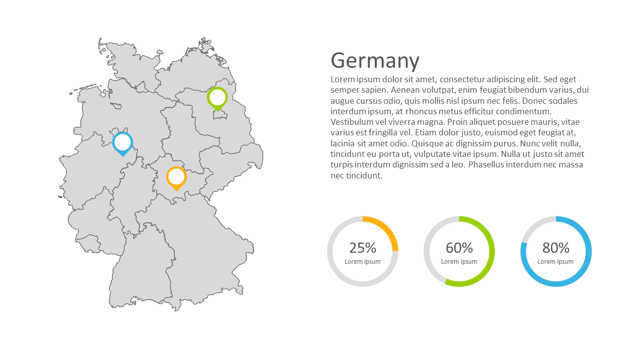
Showcase key statistics in Germany using a map and pie chart layout.
View full slide →
✓
Visualize geographic data effectively using a map and pie chart layout.
View full slide →
✓
Showcase data points across regions with this editable geographical map.
View full slide →
✓
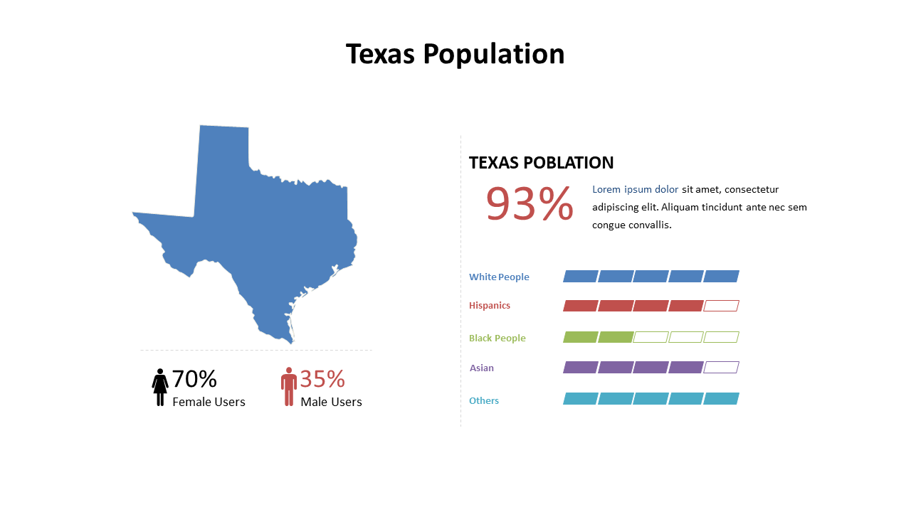
Present Texas population demographics clearly with this editable layout for PowerPoint.
View full slide →
✓
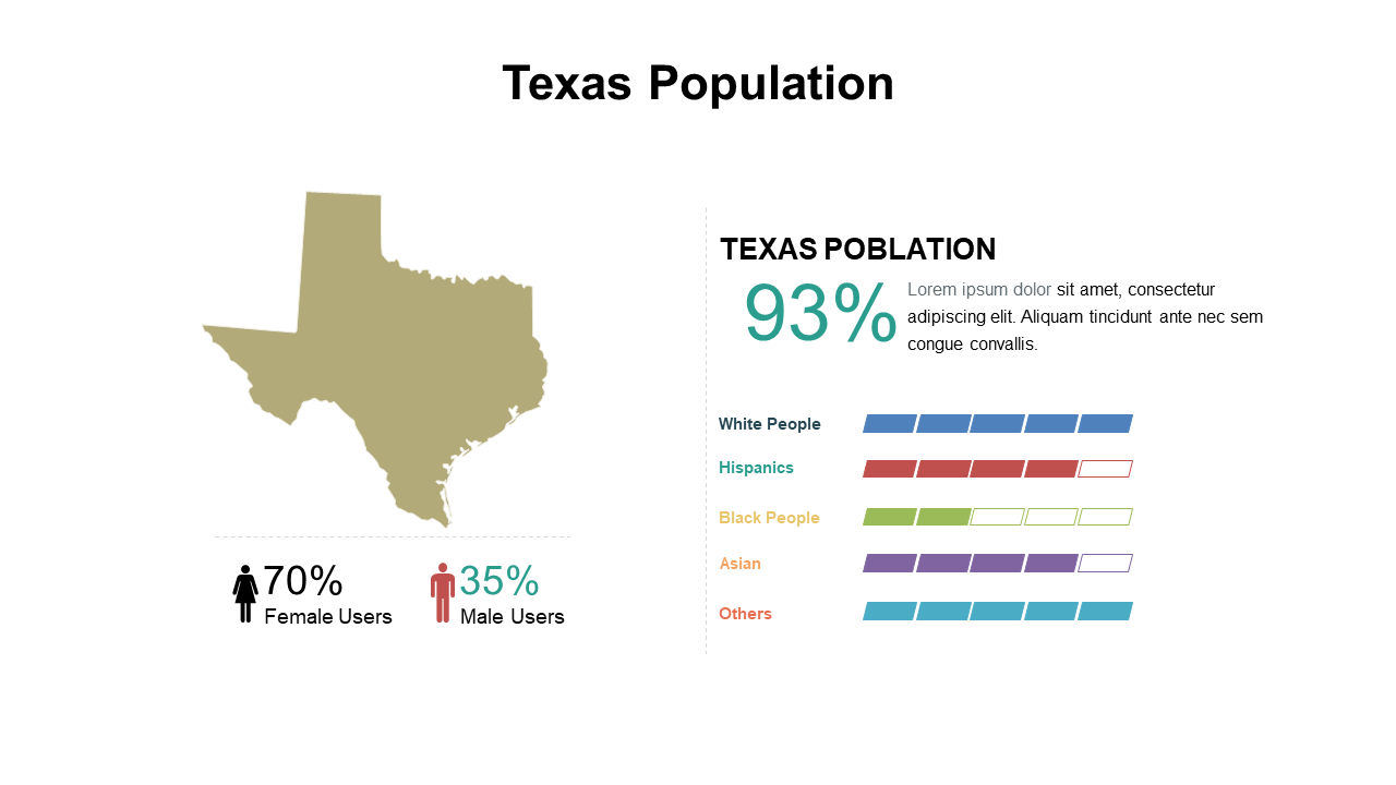
Explore Texas demographics visually with this customizable gender breakdown chart.
View full slide →
✓
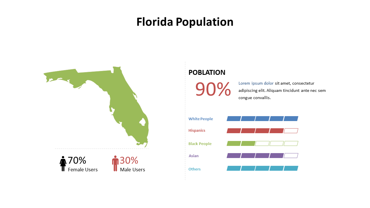
Explore Florida's population demographics effectively with this pie chart layout.
View full slide →
✓
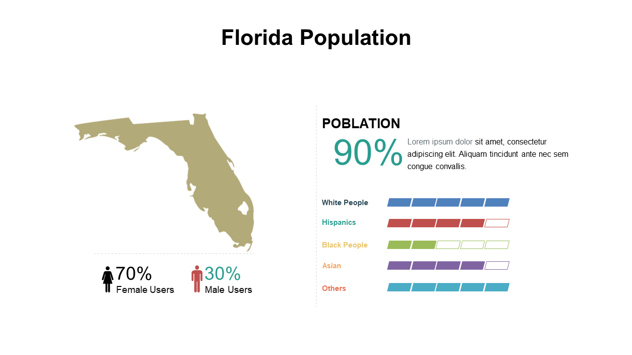
Visualize Florida's demographics with this customizable pie chart for presentations.
View full slide →
✓
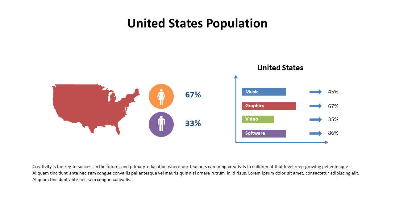
Communicate US demographic data effectively with this editable slide for presentations in PowerPoint and Google Slides.
View full slide →
✓
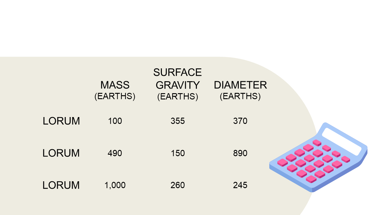
Utilize this data table layout to present planetary metrics clearly in PowerPoint.
 SlideSwift