Showing 365 slides
in Data Visualization

View full slide →
✓
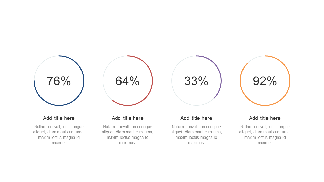
Visualize performance metrics effectively with circular progress indicators in your presentations.
View full slide →
✓
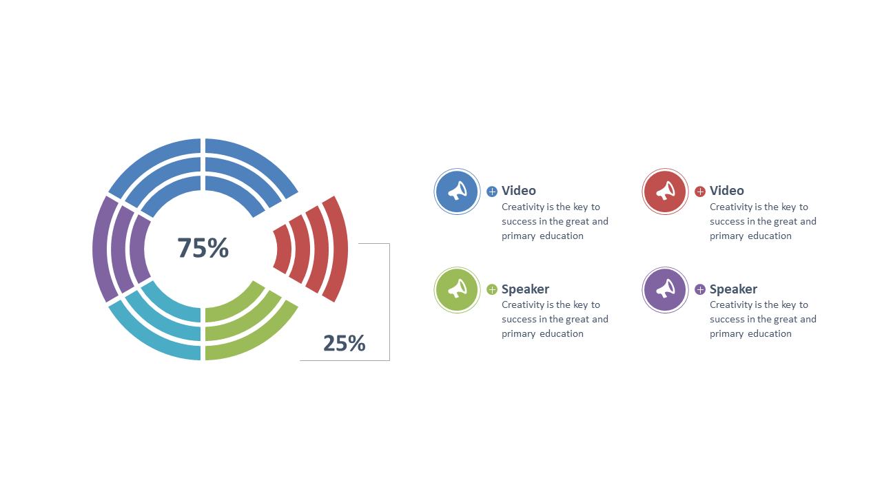
Showcase progress effectively with a circular progress chart and callouts for PowerPoint and Google Slides.
View full slide →
✓
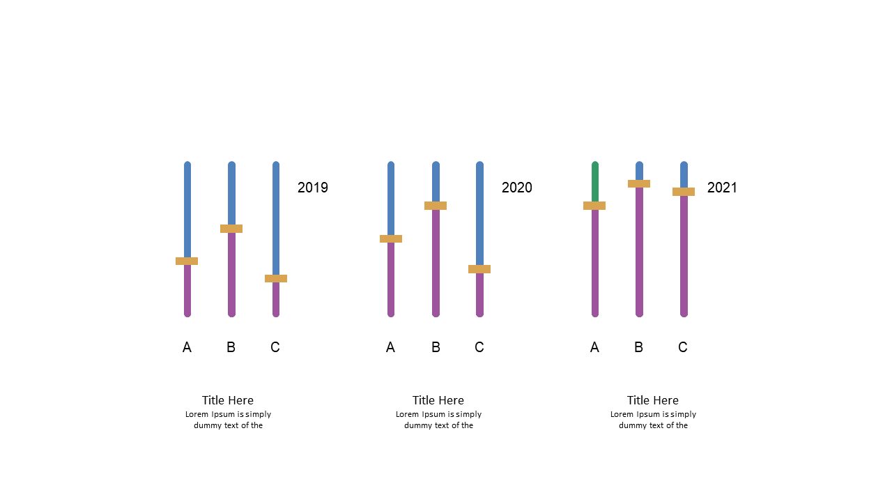
Use this vertical bar chart to present yearly data comparisons effectively in PowerPoint or Google Slides.
View full slide →
✓
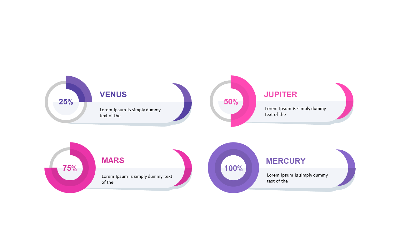
Visualize progress effectively using circular percentage indicators in PowerPoint or Google Slides.
View full slide →
✓
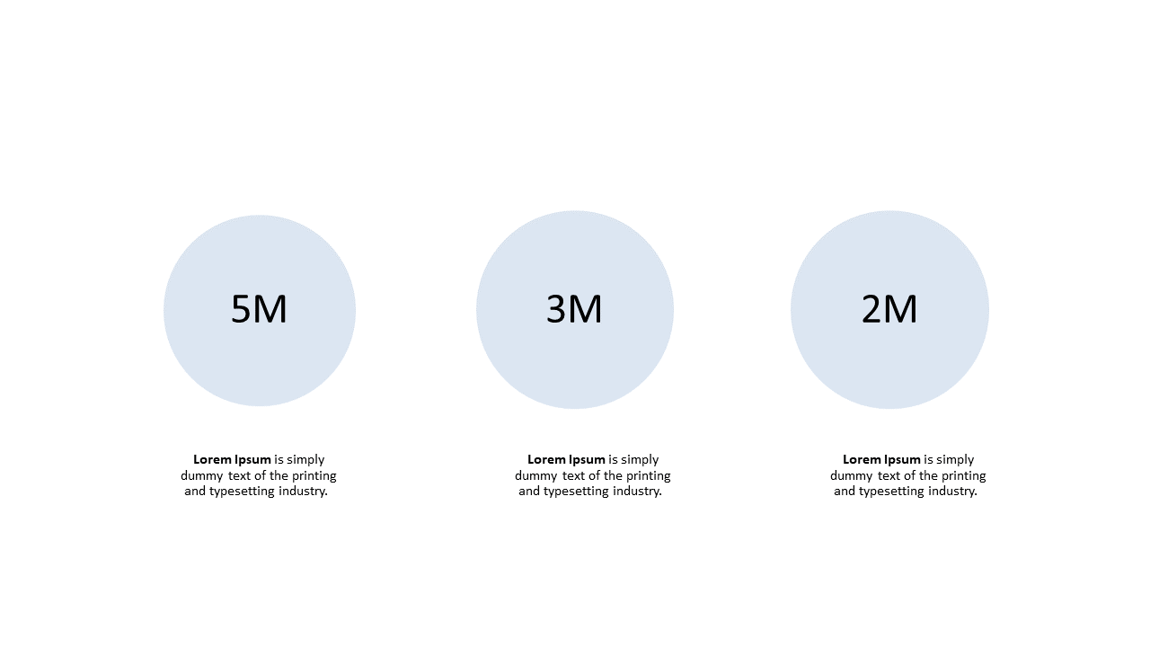
Showcase important metrics using rounded circles in PowerPoint and Google Slides.
View full slide →
✓
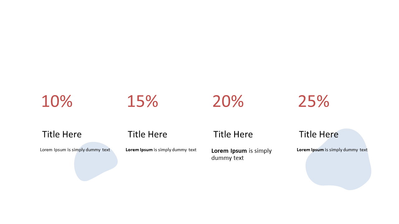
Present data clearly with this percentage distribution layout for business presentations.
View full slide →
✓
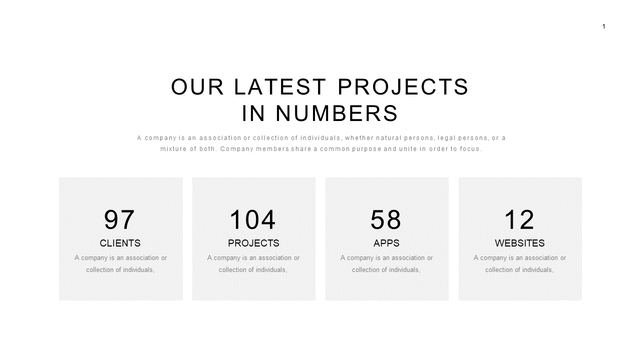
Showcase essential project data effectively with this statistics overview layout.
View full slide →
✓
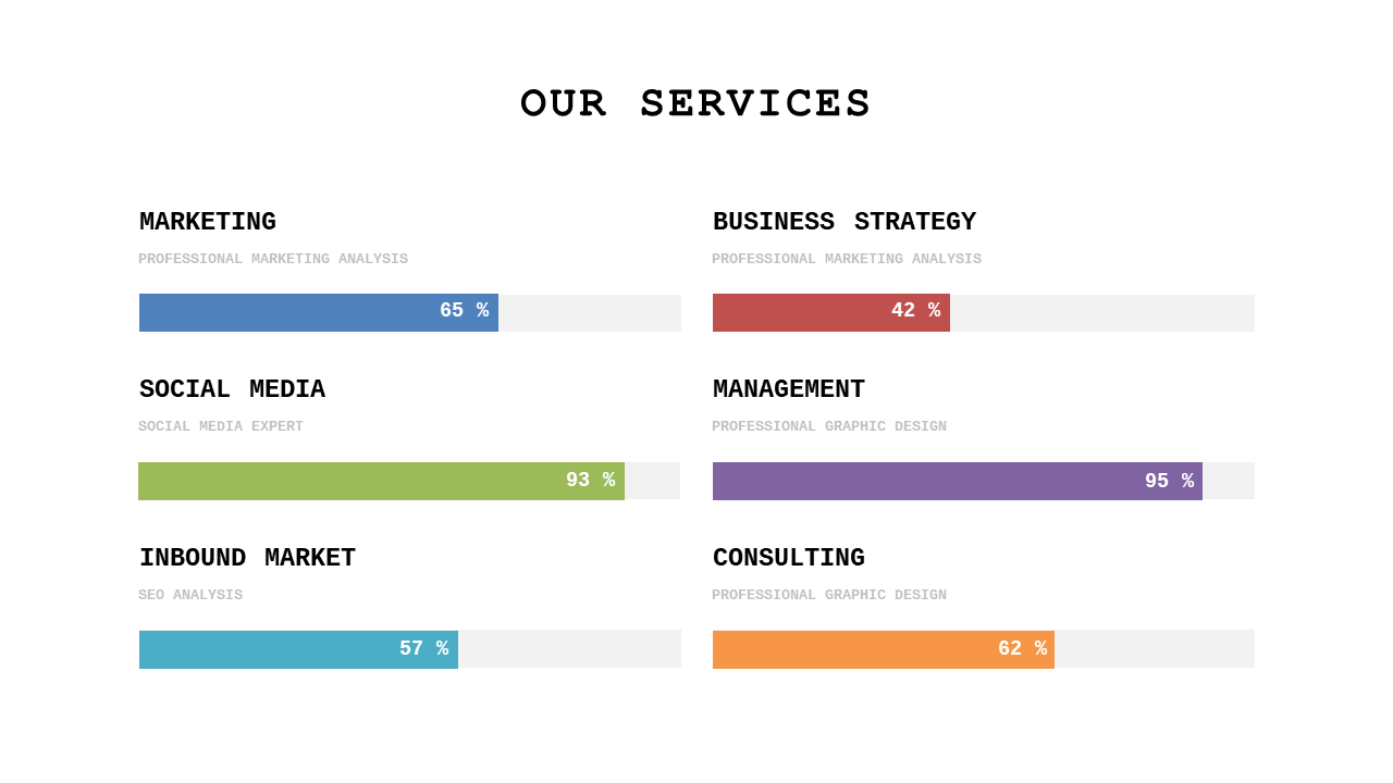
Visualize service performance effectively with this editable horizontal bar chart.
View full slide →
✓
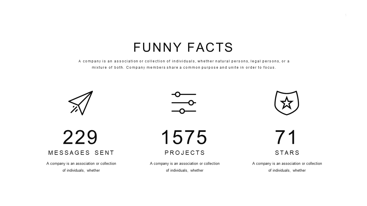
Present engaging statistics with this editable data visualization layout.
View full slide →
✓
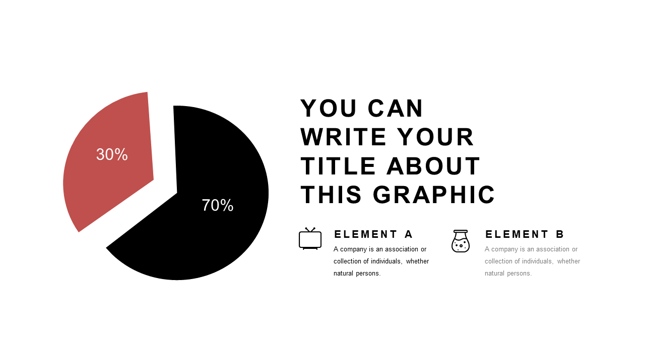
Present data comparisons clearly with this editable segmented pie chart layout for PowerPoint.
View full slide →
✓
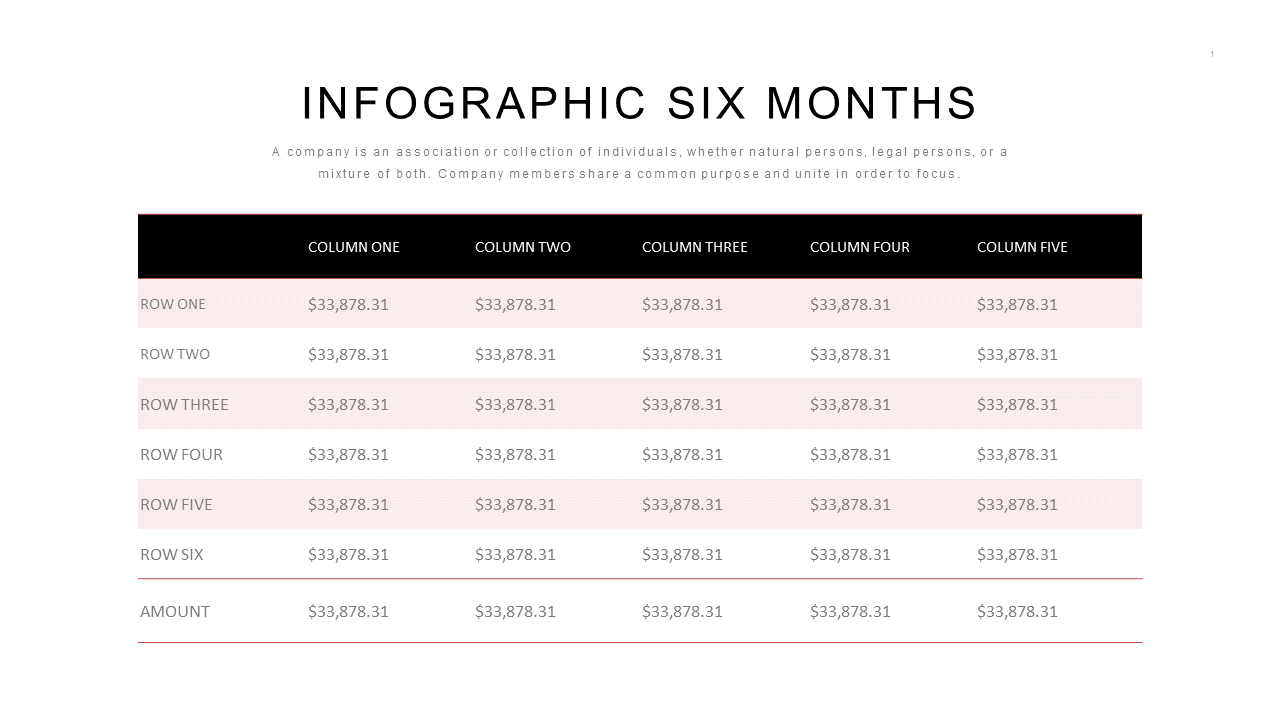
Present financial data clearly with this infographic table for effective business reporting.
View full slide →
✓
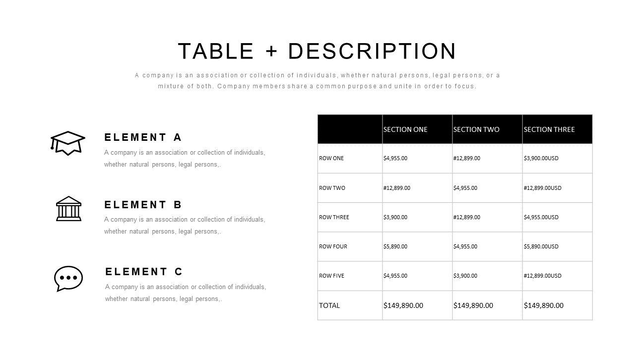
Use this structured table layout for clear data presentation in budget or project assessments.
 SlideSwift