Showing 365 slides
in Data Visualization

View full slide →
✓
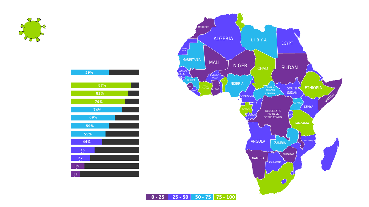
Present regional performance metrics in Africa using a color-coded map and bar chart.
View full slide →
✓
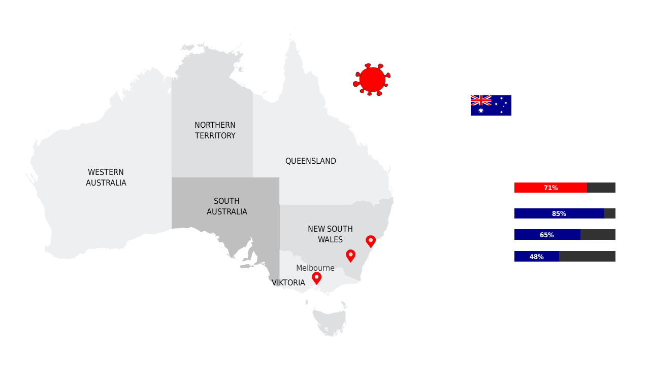
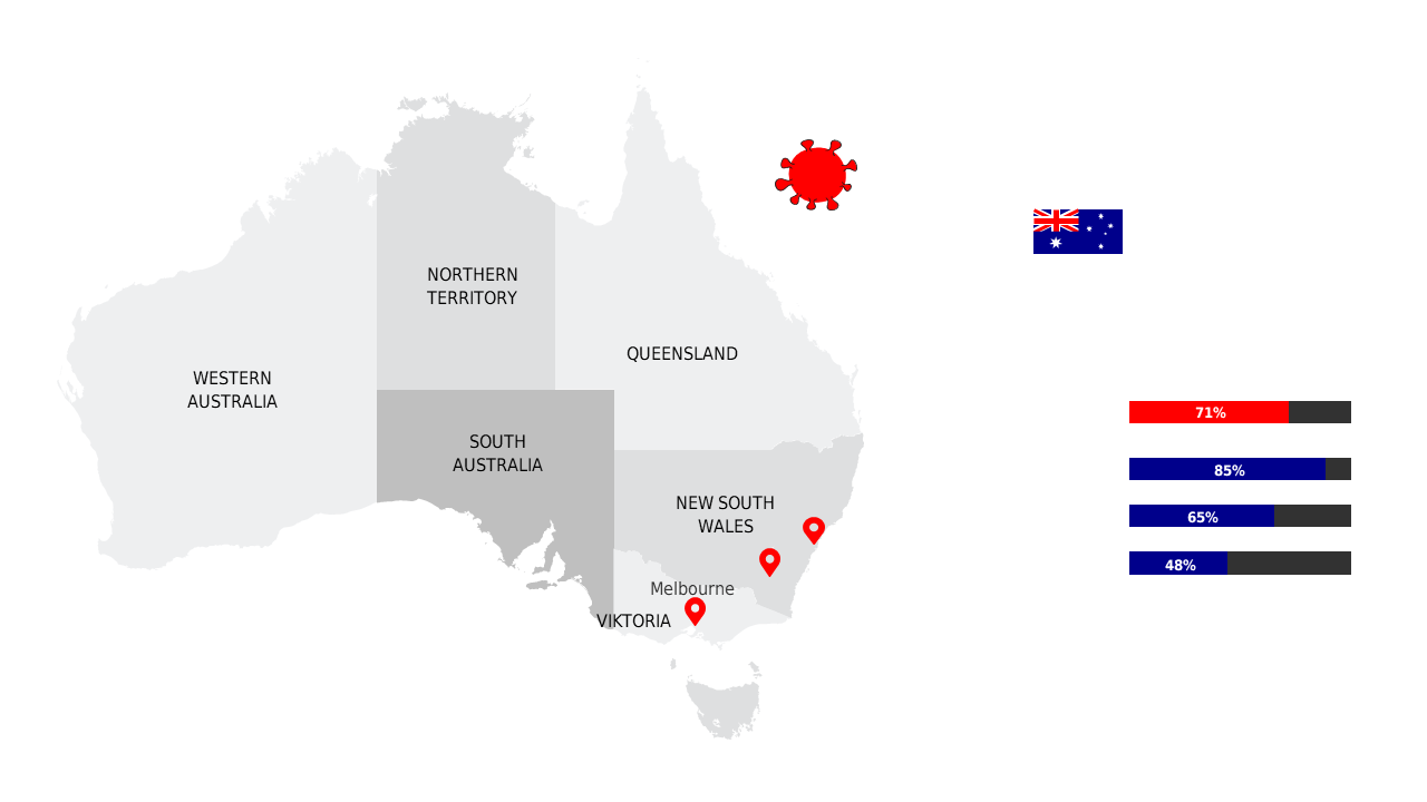
Visualize COVID-19 statistics in Australia with editable maps and color-coded data for clarity.
View full slide →
✓
Present regional COVID-19 data in Australia using customizable maps and statistics.
View full slide →
✓
Showcase COVID-19 data in Australia with clear, editable visuals for effective presentations.
View full slide →
✓
Communicate Australia's COVID-19 status using customizable maps and data visuals.
View full slide →
✓
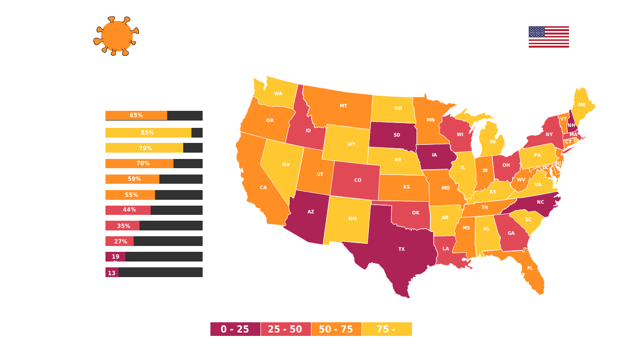
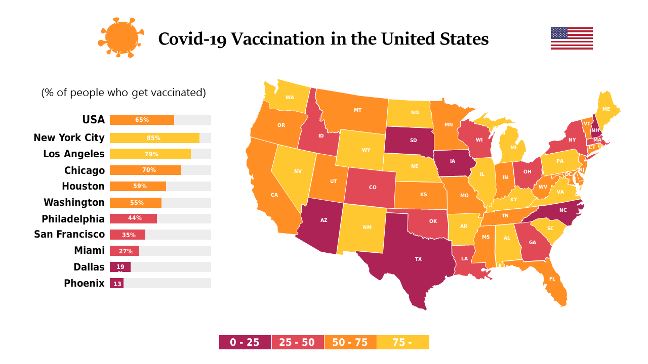
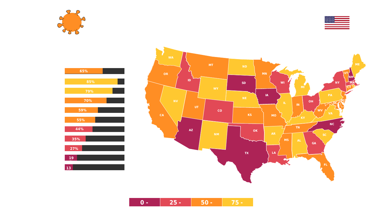
Present COVID-19 impact levels in the US with an editable heat map and data chart.
View full slide →
✓
Visualize state-level COVID-19 data in the US using an interactive heat map and chart.
View full slide →
✓
Utilize a heat map and data chart to visualize COVID-19 impact across the US states.
View full slide →
✓
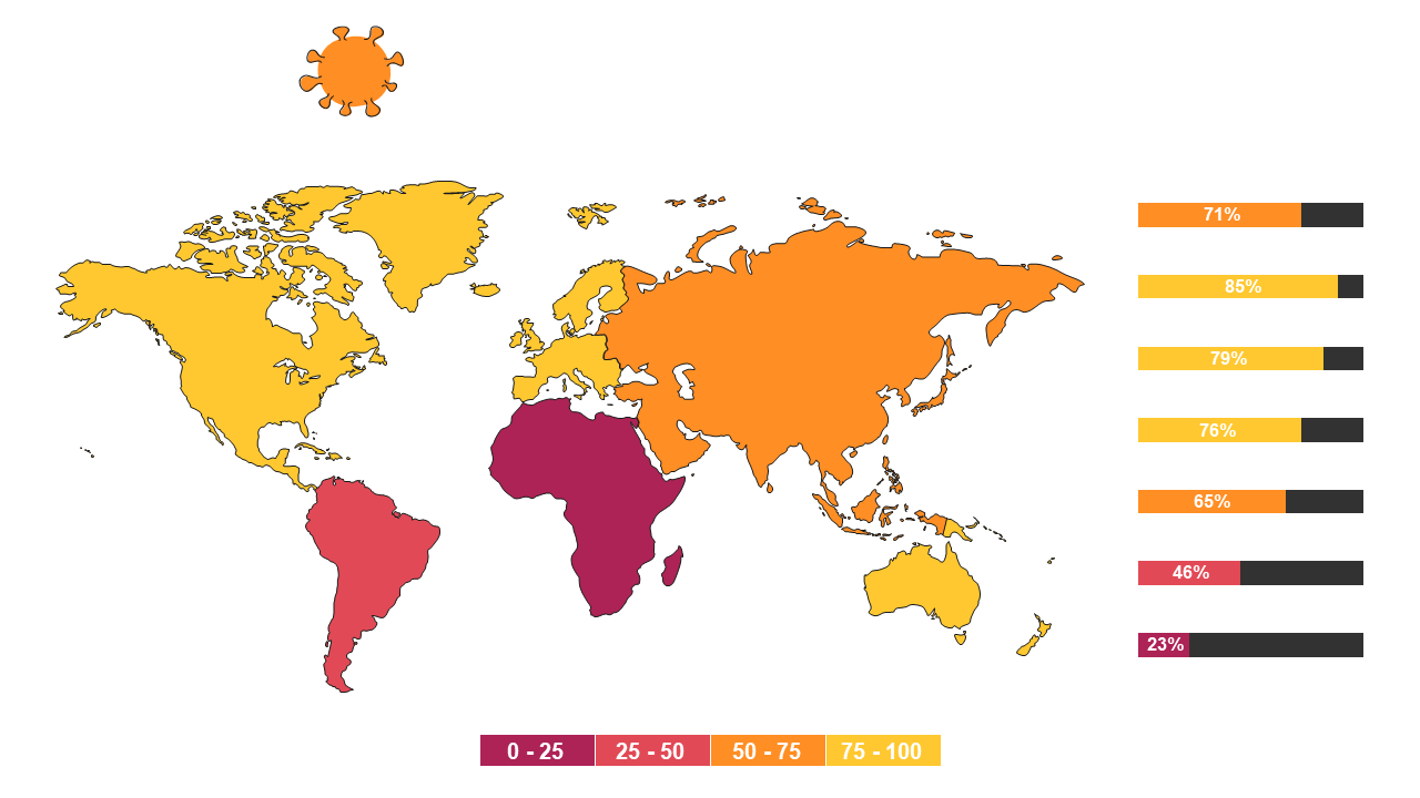
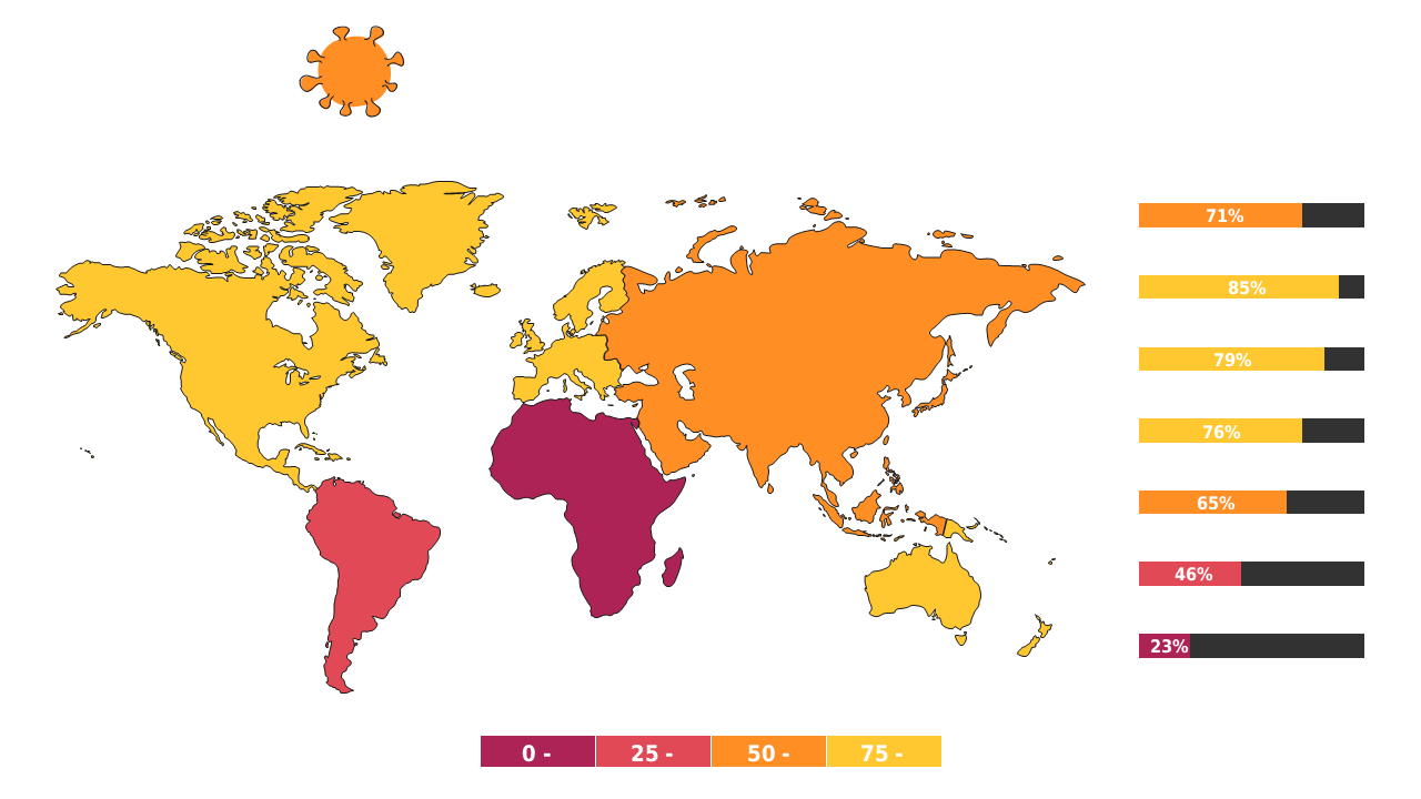
Present COVID-19 global impact clearly with an editable heat map.
View full slide →
✓
Visualize COVID-19 impact globally using an interactive heat map.
View full slide →
✓
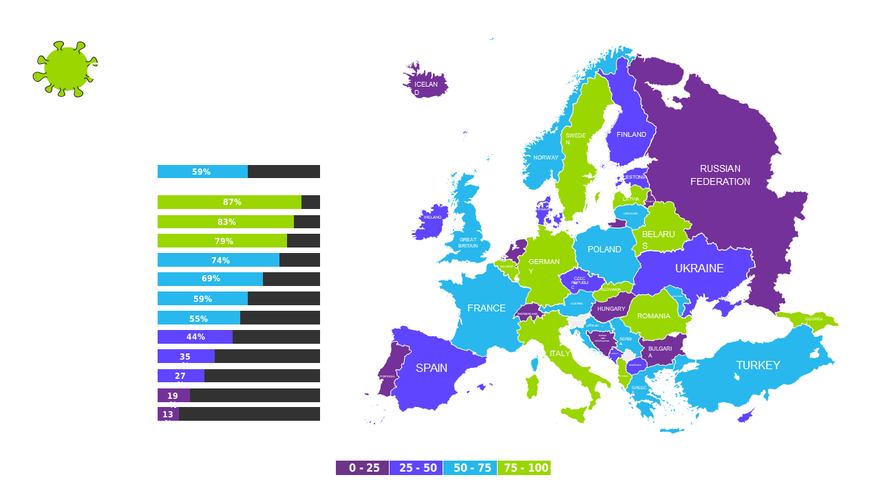
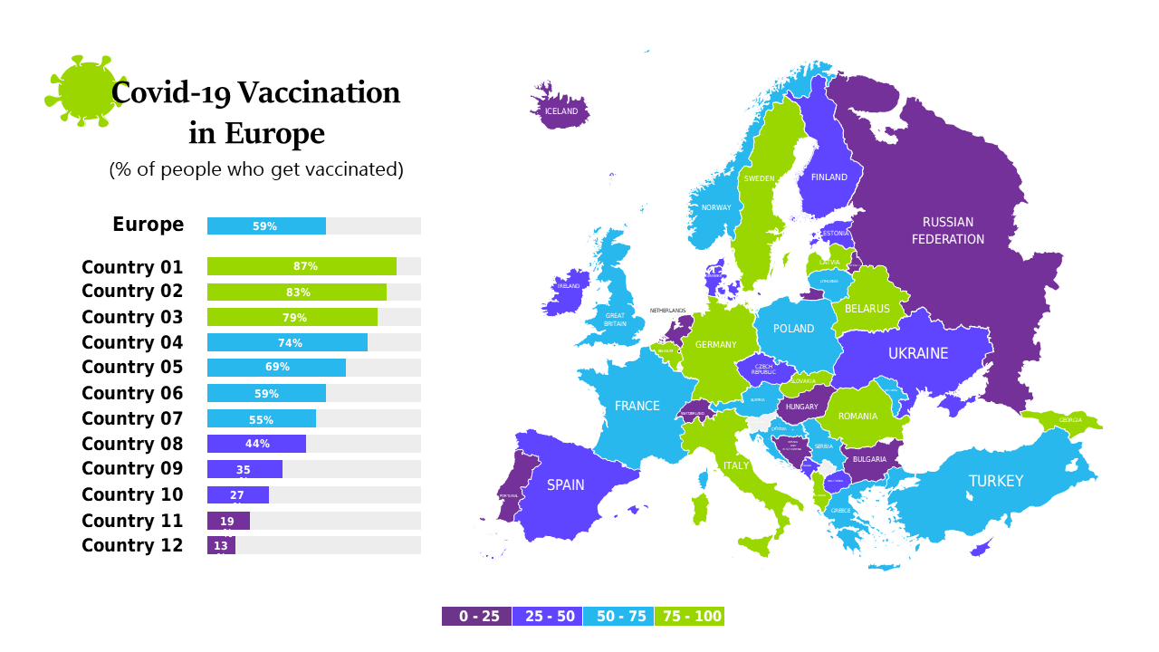
Visualize epidemic effects in Europe with editable maps and data charts.
View full slide →
✓
Showcase epidemic impacts across Europe with editable maps and charts.
 SlideSwift