SlideSwift
By Category
💼Business 📊Infographics □Minimal 🕐Timelines ✨Neumorphic 🗑Diagrams 🔄Flow Charts ✨Glassmorphism 🎨Creative 🌍Abstract 🔄Cycle Diagrams 💎Isometric 🖼Illustrations 📱Social Media 🗺MapsBy Slide Type
🚀Pitch Deck 📌Roadmap 🔍SWOT Analysis 📅Timeline 📈Gantt Chart 🏢Org Chart 📋Funnel ⚖Comparison 📄Case Study 📋Agenda ⭐Icons & Lists 👏Thank You
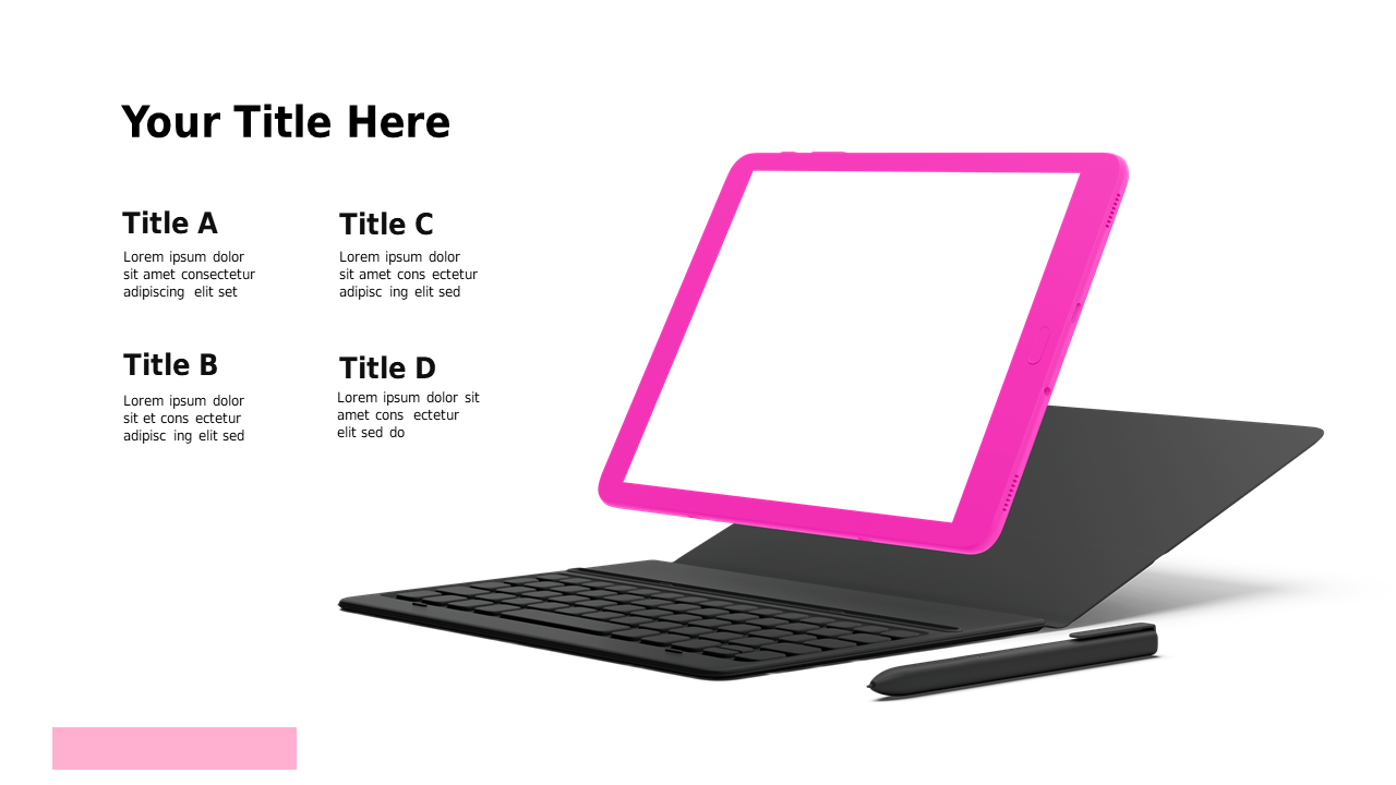
As a strategy manager, you know how vital it is to communicate complex metrics clearly. This slide offers a straightforward way to compare usability and design metrics, presented in a sleek tablet mockup. The side-by-side layout effectively showcases key percentages, making it perfect for tech presentations and design discussions. Analysts can utilize this slide to illustrate performance metrics during stakeholder meetings, ensuring everyone understands the relationship between usability and design. Consultants will find this slide valuable for client presentations, helping to drive home the importance of both metrics in product development. With easy customization options, you can quickly edit text, colors, and icons to align with your brand or presentation style. This slide not only enhances your presentation but makes your data more digestible and impactful. $0.99 — add this single slide to any deck from the SlideSwift Slide Library. No subscription needed. Mix slides from any category to build your perfect deck.
Add more from this category to your custom deck