SlideSwift
By Category
💼Business 📊Infographics □Minimal 🕐Timelines ✨Neumorphic 🗑Diagrams 🔄Flow Charts ✨Glassmorphism 🎨Creative 🌍Abstract 🔄Cycle Diagrams 💎Isometric 🖼Illustrations 📱Social Media 🗺MapsBy Slide Type
🚀Pitch Deck 📌Roadmap 🔍SWOT Analysis 📅Timeline 📈Gantt Chart 🏢Org Chart 📋Funnel ⚖Comparison 📄Case Study 📋Agenda ⭐Icons & Lists 👏Thank You
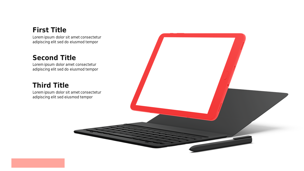
Understanding the balance between usability and design metrics is crucial for effective presentations. This slide showcases a tablet mockup with clear side-by-side comparisons of usability and design percentages, making it easy to visualize the differences at a glance. As a sales lead, you can use this slide to present findings on how design choices impact user experience, helping your team make informed decisions. A strategy manager could leverage this slide to articulate the importance of balancing aesthetics with functionality during project discussions. Meanwhile, an analyst can utilize it to present data-driven insights during team meetings, ensuring everyone is aligned on the metrics that matter. Customization is straightforward; you can easily edit the text, colors, and icons to fit your specific branding and presentation style. $0.99 — add this single slide to any deck from the SlideSwift Slide Library. No subscription needed. Mix slides from any category to build your perfect deck.
Add more from this category to your custom deck