SlideSwift
By Category
💼Business 📊Infographics □Minimal 🕐Timelines ✨Neumorphic 🗑Diagrams 🔄Flow Charts ✨Glassmorphism 🎨Creative 🌍Abstract 🔄Cycle Diagrams 💎Isometric 🖼Illustrations 📱Social Media 🗺MapsBy Slide Type
🚀Pitch Deck 📌Roadmap 🔍SWOT Analysis 📅Timeline 📈Gantt Chart 🏢Org Chart 📋Funnel ⚖Comparison 📄Case Study 📋Agenda ⭐Icons & Lists 👏Thank You
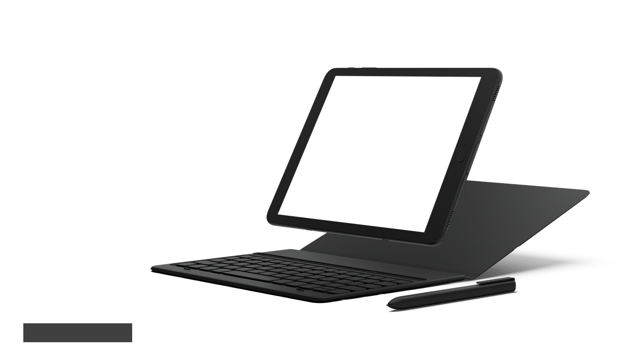
When presenting to clients or stakeholders, you often need to convey complex information simply and effectively. This slide visually represents usability versus design metrics using a clean tablet mockup, allowing you to highlight the key percentages side-by-side. In a matter of moments, you can add this slide to your presentation and immediately enhance your message. As a consultant, you can use this slide to demonstrate how usability impacts user satisfaction, making it easier for your clients to understand the importance of design choices. A sales lead can utilize this slide to showcase design improvements and their correlation with user engagement metrics, effectively persuading potential customers. For strategy managers, this slide serves as a valuable tool for discussing performance benchmarks and guiding future design decisions. Feel free to customize the text, colors, and icons to reflect your brand’s identity and meet your audience’s needs. $0.99 — add this single slide to any deck from the SlideSwift Slide Library. No subscription needed. Mix slides from any category to build your perfect deck.
Add more from this category to your custom deck