SlideSwift
By Category
💼Business 📊Infographics □Minimal 🕐Timelines ✨Neumorphic 🗑Diagrams 🔄Flow Charts ✨Glassmorphism 🎨Creative 🌍Abstract 🔄Cycle Diagrams 💎Isometric 🖼Illustrations 📱Social Media 🗺MapsBy Slide Type
🚀Pitch Deck 📌Roadmap 🔍SWOT Analysis 📅Timeline 📈Gantt Chart 🏢Org Chart 📋Funnel ⚖Comparison 📄Case Study 📋Agenda ⭐Icons & Lists 👏Thank You
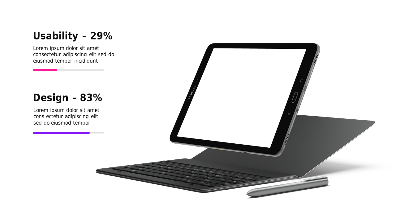
When you’re tasked with analyzing the balance between usability and design, it can be challenging to communicate the key differences clearly. This slide provides a visually engaging comparison with side-by-side metrics displayed on a sleek tablet mockup, allowing your audience to grasp critical percentages at a glance. As an analyst, you can leverage this slide to present important data during team meetings or reports, ensuring your findings are both clear and compelling. For consultants, this slide serves as an excellent tool to guide discussions on how usability impacts design choices for clients, fostering better decision-making. Sales leads can also benefit by using this slide to illustrate how design elements enhance user experience, ultimately driving sales. Plus, you have the flexibility to customize text, colors, and icons to align with your message. $0.99 — add this single slide to any deck from the SlideSwift Slide Library. No subscription needed. Mix slides from any category to build your perfect deck.
Add more from this category to your custom deck