Showing 365 slides
in Data Visualization

View full slide →
✓
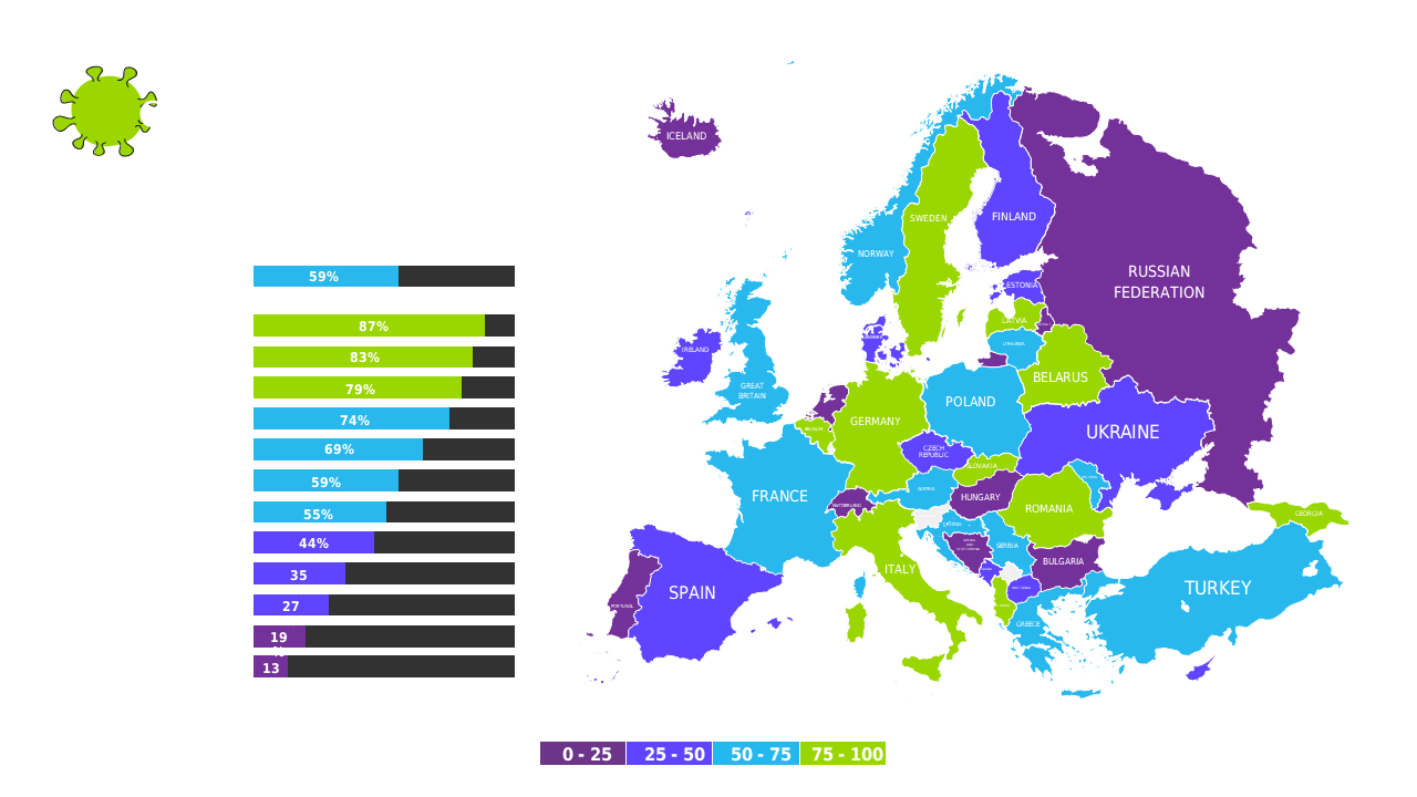
Create impactful presentations on epidemic effects in Europe using editable maps and charts.
View full slide →
✓
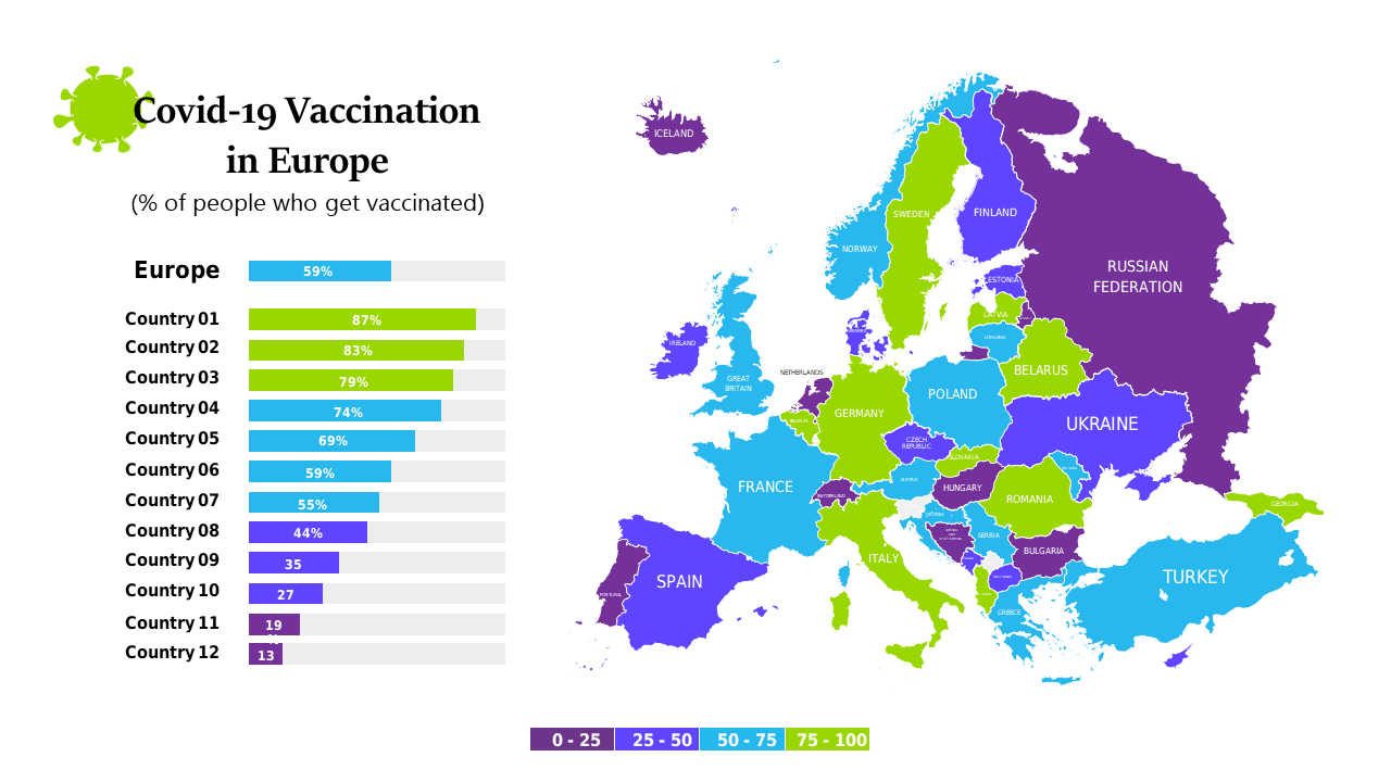
Present epidemic data across Europe with customizable maps and statistics for effective communication.
View full slide →
✓
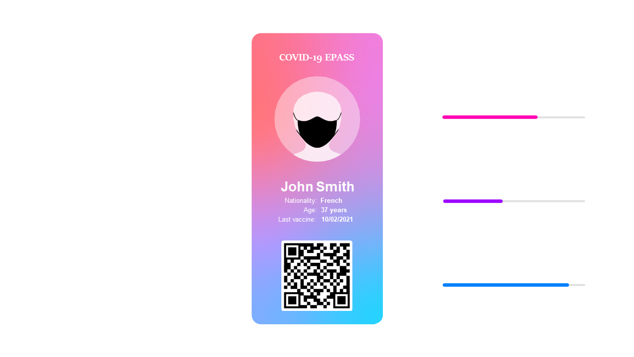
Create a sleek COVID-19 E-Pass ID card layout for healthcare presentations.
View full slide →
✓
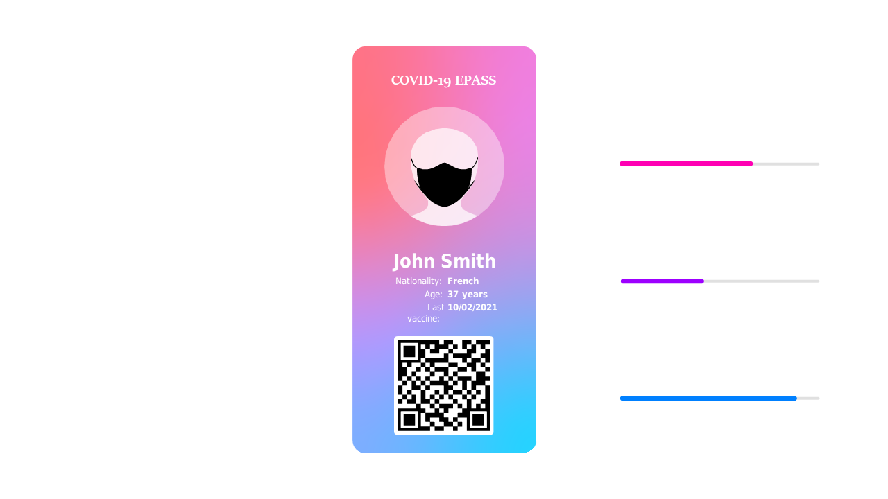
Design a modern COVID-19 E-Pass ID card layout for healthcare and events.
View full slide →
✓
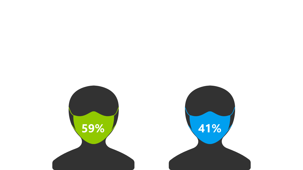
Visualize survey data comparisons using icons and percentages in PowerPoint.
View full slide →
✓
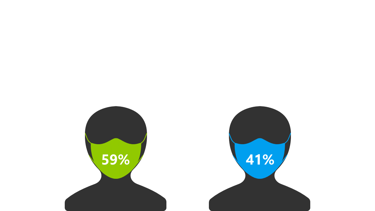
Create engaging survey comparisons with icons and percentages for presentations.
View full slide →
✓
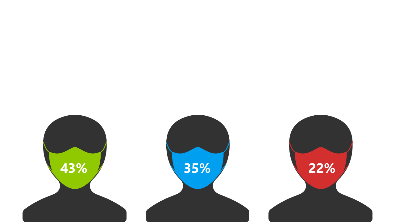
Display survey results clearly using masked figures and percentages in PowerPoint.
View full slide →
✓
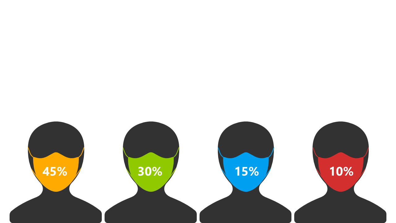
Show audience segmentation clearly with percentage distributions in presentations.
View full slide →
✓
Visualize health metrics with circular indicators, editable for PowerPoint and Google Slides.
View full slide →
✓
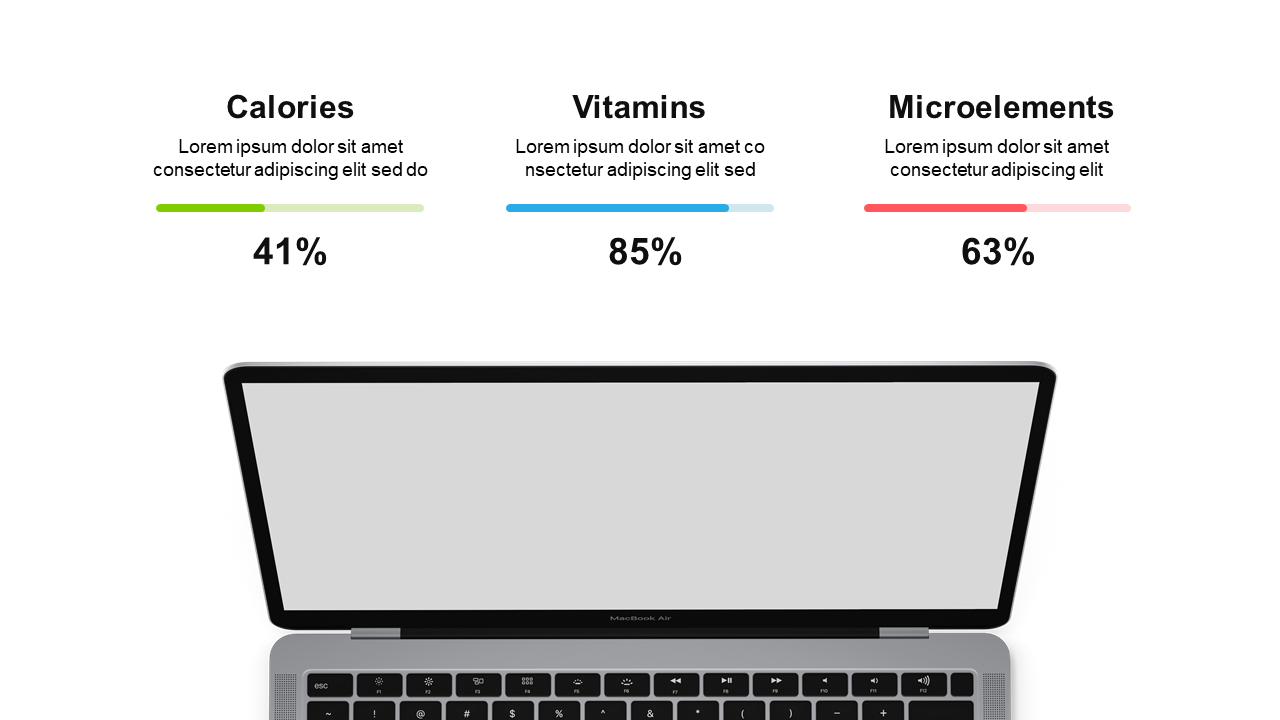
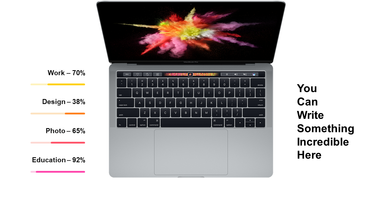
Use this laptop graphic to present percentage data effectively in your slides.
View full slide →
✓
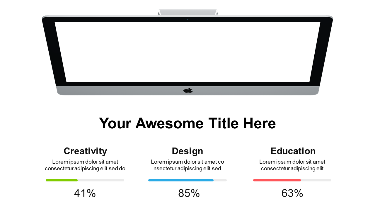
Visualize comparative data effectively using this iMac mockup layout.
View full slide →
✓
Present data effectively with this triple bar chart layout in PowerPoint or Google Slides.
 SlideSwift