SlideSwift
By Category
💼Business 📊Infographics □Minimal 🕐Timelines ✨Neumorphic 🗑Diagrams 🔄Flow Charts ✨Glassmorphism 🎨Creative 🌍Abstract 🔄Cycle Diagrams 💎Isometric 🖼Illustrations 📱Social Media 🗺MapsBy Slide Type
🚀Pitch Deck 📌Roadmap 🔍SWOT Analysis 📅Timeline 📈Gantt Chart 🏢Org Chart 📋Funnel ⚖Comparison 📄Case Study 📋Agenda ⭐Icons & Lists 👏Thank You
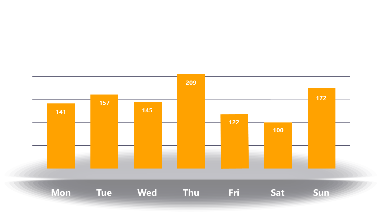
It’s Monday morning, and your team needs a clear picture of last week’s sales performance. You want to quickly highlight how each day of the week stacked up against expectations. This slide presents a clean bar graph showcasing weekly performance metrics, allowing you to visualize data at a glance. You can easily customize it to reflect your specific sales figures or engagement metrics, making it perfect for your next meeting. As a reporting manager, you’ll find this slide invaluable for succinctly summarizing results. Data analysts can use this graph to identify trends and inform decision-making, while finance leads can present key metrics during quarterly reviews. The graph’s simplicity ensures that your audience focuses on the data rather than getting distracted by clutter. Customization is straightforward, so you can adjust the colors and labels to fit your brand or data needs. $0.99 — add this single slide to any deck from the SlideSwift Slide Library. No subscription needed. Mix slides from any category to build your perfect deck.
Add more from this category to your custom deck