SlideSwift
By Category
💼Business 📊Infographics □Minimal 🕐Timelines ✨Neumorphic 🗑Diagrams 🔄Flow Charts ✨Glassmorphism 🎨Creative 🌍Abstract 🔄Cycle Diagrams 💎Isometric 🖼Illustrations 📱Social Media 🗺MapsBy Slide Type
🚀Pitch Deck 📌Roadmap 🔍SWOT Analysis 📅Timeline 📈Gantt Chart 🏢Org Chart 📋Funnel ⚖Comparison 📄Case Study 📋Agenda ⭐Icons & Lists 👏Thank You
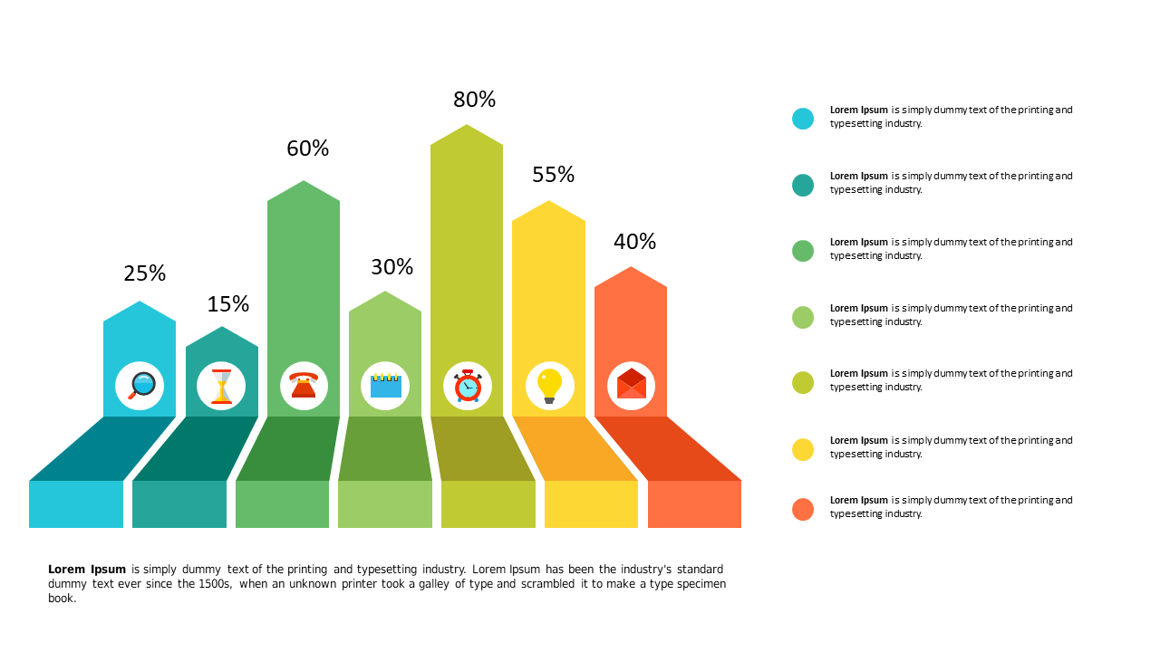
As a reporting manager, you know how crucial it is to present data clearly and persuasively. This slide provides an editable bar chart that visualizes weekly performance data across multiple days, making it easy for your audience to grasp the key metrics at a glance. The chart’s design allows for straightforward comparisons, enabling you to highlight trends and insights that drive decision-making. For data analysts, this slide is a perfect way to showcase your findings in a digestible format, allowing stakeholders to see the impact of various factors on performance. Meanwhile, finance leads can utilize this slide to present financial metrics, ensuring that even complex data is communicated effectively to the team. Customizing the chart is simple; just input your data and adjust colors to align with your branding. $0.99 — add this single slide to any deck from the SlideSwift Slide Library. No subscription needed. Mix slides from any category to build your perfect deck.
Add more from this category to your custom deck