SlideSwift
By Category
💼Business 📊Infographics □Minimal 🕐Timelines ✨Neumorphic 🗑Diagrams 🔄Flow Charts ✨Glassmorphism 🎨Creative 🌍Abstract 🔄Cycle Diagrams 💎Isometric 🖼Illustrations 📱Social Media 🗺MapsBy Slide Type
🚀Pitch Deck 📌Roadmap 🔍SWOT Analysis 📅Timeline 📈Gantt Chart 🏢Org Chart 📋Funnel ⚖Comparison 📄Case Study 📋Agenda ⭐Icons & Lists 👏Thank You
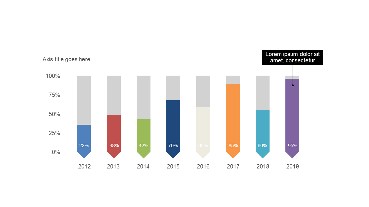
In today’s fast-paced environment, effectively visualizing data can be a challenge. This slide presents a clear vertical bar chart that displays percentage data across different years, making it easy to identify trends at a glance. The visual is designed to highlight key performance metrics, allowing your audience to grasp important information quickly. As a business analyst, you can use this slide to present data-driven insights during meetings, ensuring your findings are both impactful and easy to understand. Reporting managers will find this slide invaluable when creating reports that need to convey performance trends over multiple years, simplifying complex data into easily digestible visuals. For data analysts, this chart is perfect for showcasing year-over-year changes, facilitating discussions around data interpretation and forecasting. You can easily customize the colors and labels to align with your brand or preferences. $0.99 — add this single slide to any deck from the SlideSwift Slide Library. No subscription needed. Mix slides from any category to build your perfect deck.
Add more from this category to your custom deck