SlideSwift
By Category
💼Business 📊Infographics □Minimal 🕐Timelines ✨Neumorphic 🗑Diagrams 🔄Flow Charts ✨Glassmorphism 🎨Creative 🌍Abstract 🔄Cycle Diagrams 💎Isometric 🖼Illustrations 📱Social Media 🗺MapsBy Slide Type
🚀Pitch Deck 📌Roadmap 🔍SWOT Analysis 📅Timeline 📈Gantt Chart 🏢Org Chart 📋Funnel ⚖Comparison 📄Case Study 📋Agenda ⭐Icons & Lists 👏Thank You
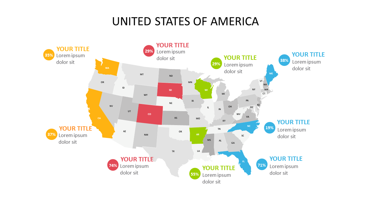
When presenting data, clarity is key. A complex spreadsheet can easily confuse your audience, but a well-designed map can turn numbers into a visual story. This slide shows the United States with states highlighted in different colors based on percentage data, making it easy to understand and analyze geographical distributions at a glance. As a sales territory manager, you can use this slide to illustrate sales performance across different regions, helping your team identify areas for improvement. Meanwhile, a logistics manager can utilize this slide to present distribution routes and regional demands, ensuring resources are allocated efficiently. Operations managers will find this slide valuable for visualizing operational metrics across states, making strategic planning smoother. Customizing state colors is straightforward, allowing you to tailor the visual to your specific data. $0.99 — add this single slide to any deck from the SlideSwift Slide Library. No subscription needed. Mix slides from any category to build your perfect deck.
Add more from this category to your custom deck