SlideSwift
By Category
💼Business 📊Infographics □Minimal 🕐Timelines ✨Neumorphic 🗑Diagrams 🔄Flow Charts ✨Glassmorphism 🎨Creative 🌍Abstract 🔄Cycle Diagrams 💎Isometric 🖼Illustrations 📱Social Media 🗺MapsBy Slide Type
🚀Pitch Deck 📌Roadmap 🔍SWOT Analysis 📅Timeline 📈Gantt Chart 🏢Org Chart 📋Funnel ⚖Comparison 📄Case Study 📋Agenda ⭐Icons & Lists 👏Thank You
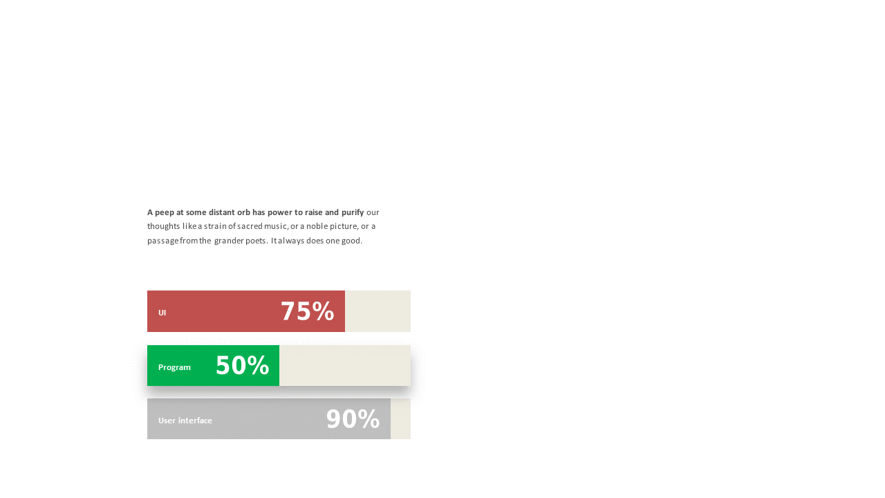
You’re preparing for an important meeting and realize you need to present multiple metrics clearly. This slide showcases a triple bar chart layout, allowing for a straightforward comparison of three distinct metrics. With percentage labels for clarity, your audience can grasp the data instantly. The visual appeal of the slide enhances your presentation, making it easy to convey complex information simply. As a business analyst, you can use this slide to compare sales performance across different regions, providing insights that drive strategic decisions. For a reporting manager, this slide can summarize quarterly performance metrics, making it ideal for executive reviews. Meanwhile, a data analyst can utilize it to highlight trends in user engagement over time, ensuring that key insights are communicated effectively. Customization is simple, enabling you to adjust colors and bar lengths to fit your branding or presentation style. $0.99 — add this single slide to any deck from the SlideSwift Slide Library. No subscription needed. Mix slides from any category to build your perfect deck.
Add more from this category to your custom deck