SlideSwift
By Category
💼Business 📊Infographics □Minimal 🕐Timelines ✨Neumorphic 🗑Diagrams 🔄Flow Charts ✨Glassmorphism 🎨Creative 🌍Abstract 🔄Cycle Diagrams 💎Isometric 🖼Illustrations 📱Social Media 🗺MapsBy Slide Type
🚀Pitch Deck 📌Roadmap 🔍SWOT Analysis 📅Timeline 📈Gantt Chart 🏢Org Chart 📋Funnel ⚖Comparison 📄Case Study 📋Agenda ⭐Icons & Lists 👏Thank You
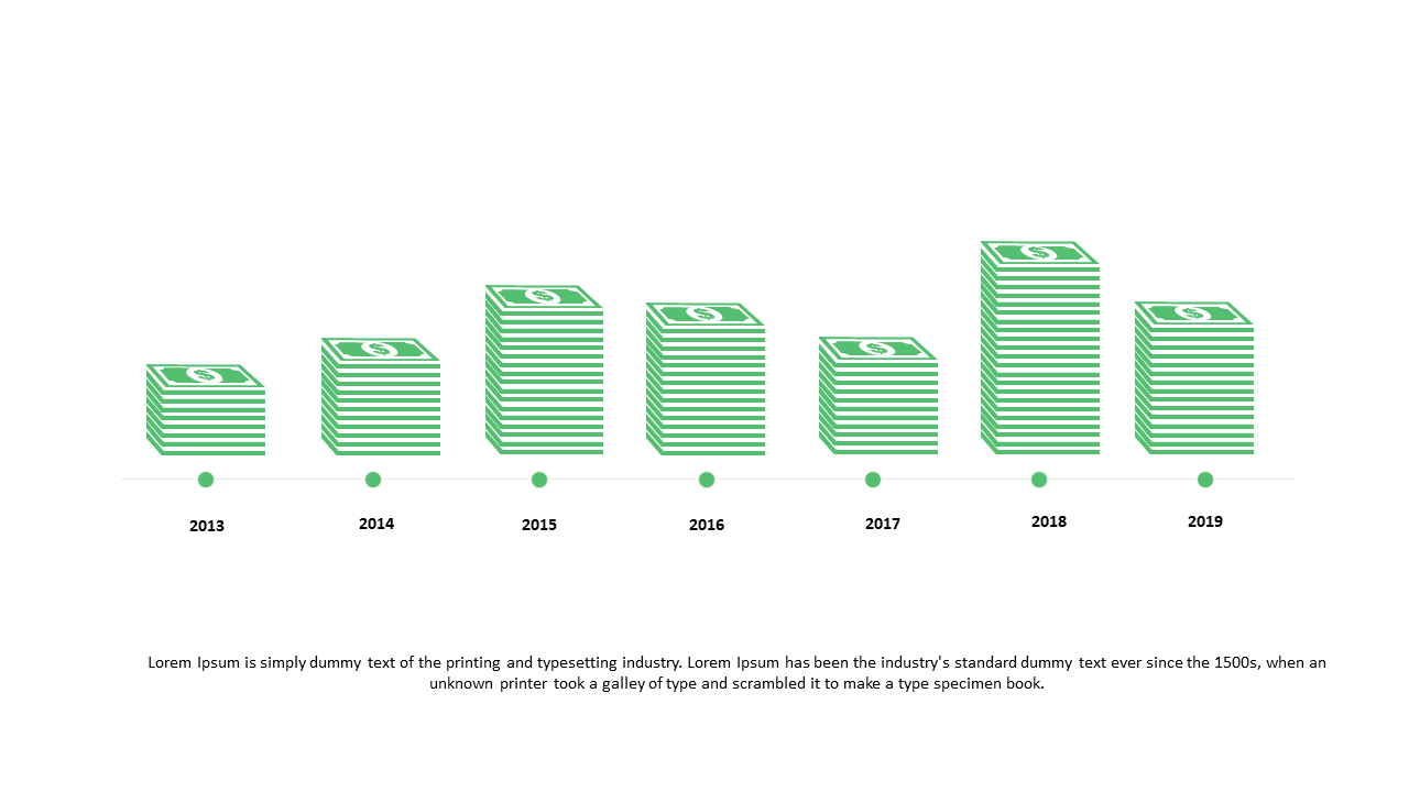
When you’re under pressure to showcase annual financial trends, you need visuals that communicate your message quickly and clearly. This slide presents a stacked bar graph that captures financial data across multiple years, allowing your audience to see growth and changes at a glance. The design includes clearly labeled axes and vibrant color options to distinguish different data series, making your presentation both informative and engaging. As a business analyst, you can use this slide to illustrate revenue growth or cost reductions over time, ensuring that stakeholders grasp the key insights immediately. Reporting managers will find this slide invaluable for summarizing quarterly results, helping teams to understand performance benchmarks. Data analysts can utilize it to highlight discrepancies and trends in large datasets, drawing attention to significant findings. Customize the colors and data inputs easily to fit your particular narrative. $0.99 — add this single slide to any deck from the SlideSwift Slide Library. No subscription needed. Mix slides from any category to build your perfect deck.
Add more from this category to your custom deck