SlideSwift
By Category
💼Business 📊Infographics □Minimal 🕐Timelines ✨Neumorphic 🗑Diagrams 🔄Flow Charts ✨Glassmorphism 🎨Creative 🌍Abstract 🔄Cycle Diagrams 💎Isometric 🖼Illustrations 📱Social Media 🗺MapsBy Slide Type
🚀Pitch Deck 📌Roadmap 🔍SWOT Analysis 📅Timeline 📈Gantt Chart 🏢Org Chart 📋Funnel ⚖Comparison 📄Case Study 📋Agenda ⭐Icons & Lists 👏Thank You
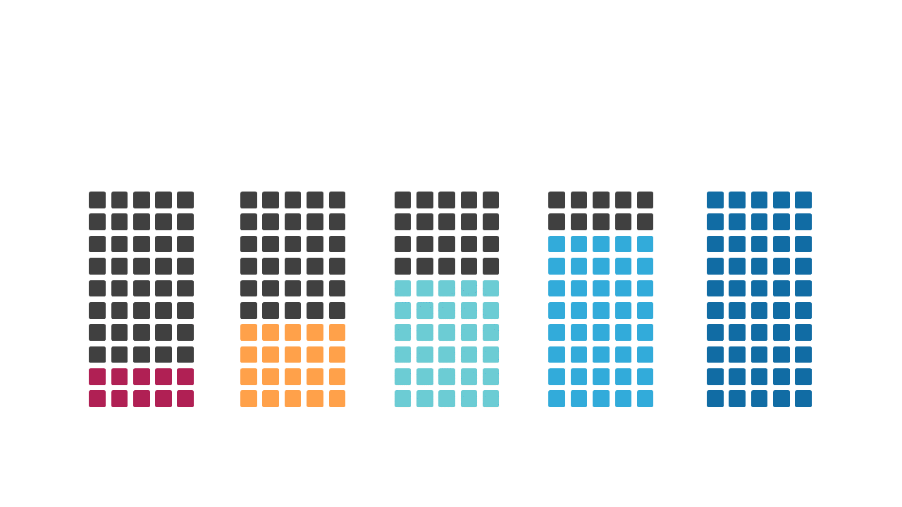
Data presentations can fall flat when the numbers don’t tell a compelling story. This gradient stacked bar chart adds a vibrant visual element to your data comparisons, making trends and differences stand out clearly. With colorful gradient blocks, you can easily identify which categories are performing well and which need attention. As a data analyst, utilize this slide to present insights from complex datasets in a straightforward manner. Finance leads can leverage this chart to showcase budget allocations and spending trends over time, making financial discussions more engaging. Business analysts can use it to highlight performance metrics across various departments, ensuring that stakeholders grasp key information quickly. Customizing the colors is simple, allowing you to align the visual with your branding or presentation theme. $0.99 — add this single slide to any deck from the SlideSwift Slide Library. No subscription needed. Mix slides from any category to build your perfect deck.
Add more from this category to your custom deck