SlideSwift
By Category
💼Business 📊Infographics □Minimal 🕐Timelines ✨Neumorphic 🗑Diagrams 🔄Flow Charts ✨Glassmorphism 🎨Creative 🌍Abstract 🔄Cycle Diagrams 💎Isometric 🖼Illustrations 📱Social Media 🗺MapsBy Slide Type
🚀Pitch Deck 📌Roadmap 🔍SWOT Analysis 📅Timeline 📈Gantt Chart 🏢Org Chart 📋Funnel ⚖Comparison 📄Case Study 📋Agenda ⭐Icons & Lists 👏Thank You
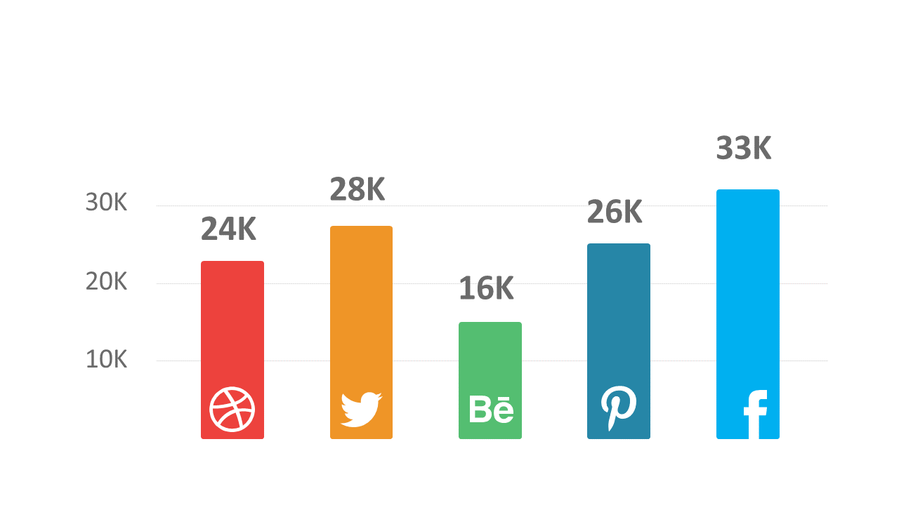
As a business analyst, you often face the challenge of making complex data easy to understand for stakeholders. This slide presents a bar chart that clearly compares social media engagement metrics across various platforms. The visual layout emphasizes differences in performance, making it straightforward for any audience to grasp. Reporting managers can utilize this slide to showcase trends in engagement during quarterly presentations, ensuring their findings are backed by visually impactful data. Similarly, data analysts will find it invaluable when highlighting key performance indicators in meetings, enabling them to focus discussions around the most relevant metrics. Customizing this slide is simple; you can edit the chart’s values and colors to match your branding or highlight specific data points. With this bar chart, you can enhance your presentations without the hassle of creating visuals from scratch. $0.99 — add this single slide to any deck from the SlideSwift Slide Library. No subscription needed. Mix slides from any category to build your perfect deck.
Add more from this category to your custom deck