SlideSwift
By Category
💼Business 📊Infographics □Minimal 🕐Timelines ✨Neumorphic 🗑Diagrams 🔄Flow Charts ✨Glassmorphism 🎨Creative 🌍Abstract 🔄Cycle Diagrams 💎Isometric 🖼Illustrations 📱Social Media 🗺MapsBy Slide Type
🚀Pitch Deck 📌Roadmap 🔍SWOT Analysis 📅Timeline 📈Gantt Chart 🏢Org Chart 📋Funnel ⚖Comparison 📄Case Study 📋Agenda ⭐Icons & Lists 👏Thank You
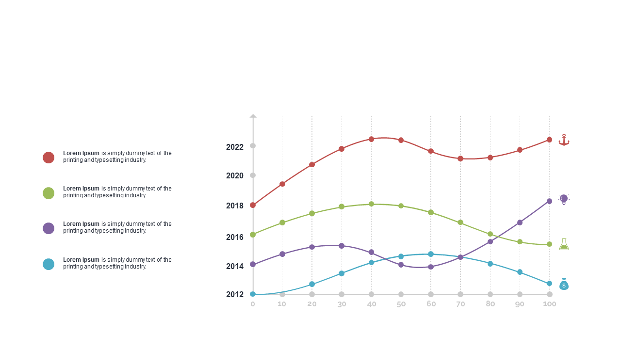
When you need to convey multiple data trends, a straightforward visual solution can make all the difference. This multi-series line chart effectively displays data trends over time, allowing your audience to grasp complex information at a glance. With its clear lines and distinct color coding, this slide presents a professional look that captures attention and facilitates understanding. Finance leads can use this slide to showcase quarterly performance trends in meetings, providing clarity on various financial metrics. Business analysts will find it useful for visualizing comparative data, helping stakeholders make informed decisions based on historical performance. Meanwhile, reporting managers can integrate this chart into their reports, ensuring that crucial insights are communicated effectively. Customization is easy; simply input your data points to reflect your specific needs. $0.99 — add this single slide to any deck from the SlideSwift Slide Library. No subscription needed. Mix slides from any category to build your perfect deck.
Add more from this category to your custom deck