SlideSwift
By Category
💼Business 📊Infographics □Minimal 🕐Timelines ✨Neumorphic 🗑Diagrams 🔄Flow Charts ✨Glassmorphism 🎨Creative 🌍Abstract 🔄Cycle Diagrams 💎Isometric 🖼Illustrations 📱Social Media 🗺MapsBy Slide Type
🚀Pitch Deck 📌Roadmap 🔍SWOT Analysis 📅Timeline 📈Gantt Chart 🏢Org Chart 📋Funnel ⚖Comparison 📄Case Study 📋Agenda ⭐Icons & Lists 👏Thank You
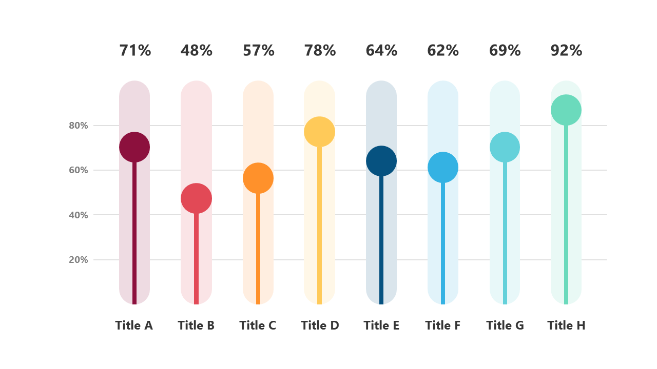
In today’s fast-paced environment, presenting data clearly can be a challenge. You need to convey insights quickly, and a cluttered slide can leave your audience confused. With this horizontal bar chart slide, you can easily display percentage indicators for various items, making comparisons straightforward. The clean design ensures that your data stands out, allowing your audience to grasp key points at a glance. As a data analyst, you can utilize this slide to highlight trends or differences in metrics, making your analysis more impactful. A finance lead can leverage this chart to present budget variances or sales figures, ensuring stakeholders understand financial performance. Meanwhile, a business analyst can use the slide to illustrate survey results or customer feedback, driving home the importance of specific data points. Customizing titles and data is a breeze, allowing you to tailor it to your message. $0.99 — add this single slide to any deck from the SlideSwift Slide Library. No subscription needed. Mix slides from any category to build your perfect deck.
Add more from this category to your custom deck