SlideSwift
By Category
💼Business 📊Infographics □Minimal 🕐Timelines ✨Neumorphic 🗑Diagrams 🔄Flow Charts ✨Glassmorphism 🎨Creative 🌍Abstract 🔄Cycle Diagrams 💎Isometric 🖼Illustrations 📱Social Media 🗺MapsBy Slide Type
🚀Pitch Deck 📌Roadmap 🔍SWOT Analysis 📅Timeline 📈Gantt Chart 🏢Org Chart 📋Funnel ⚖Comparison 📄Case Study 📋Agenda ⭐Icons & Lists 👏Thank You
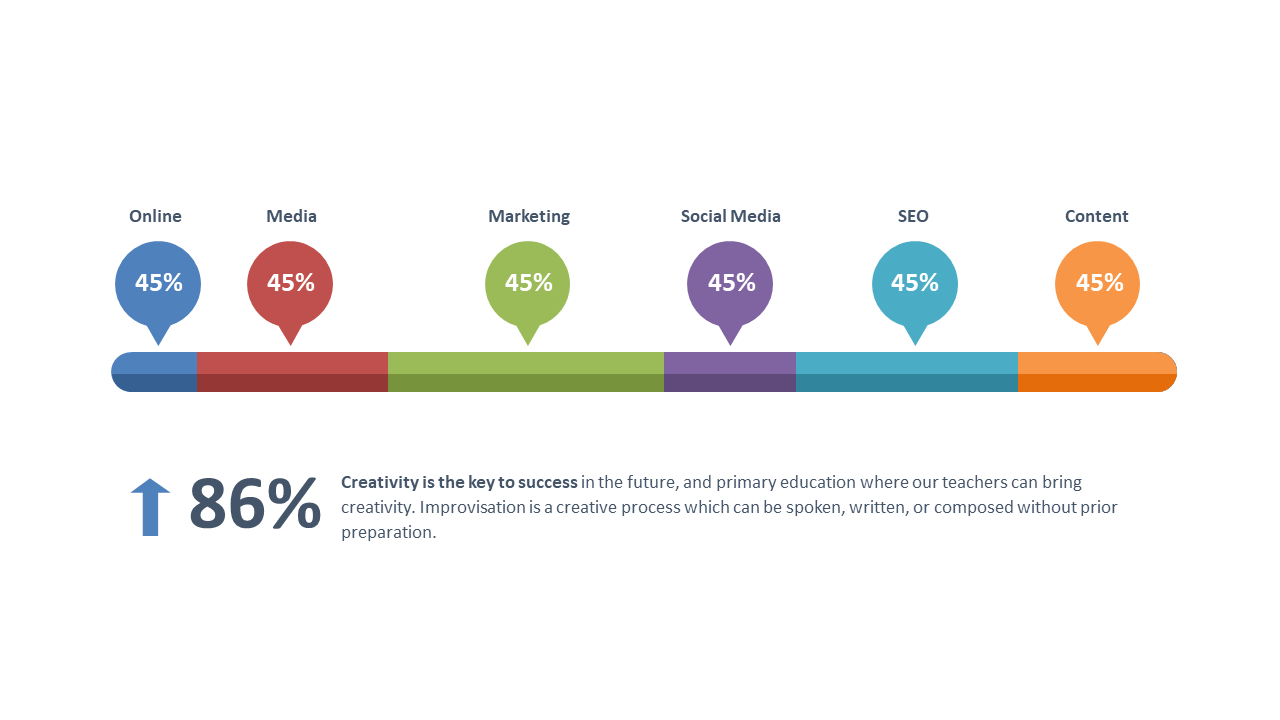
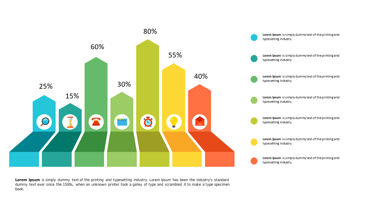
When presenting data, clarity is key. Reporting managers frequently need effective ways to visualize information, and this horizontal bar chart does just that. With clearly defined categories and percentages displayed side by side, you can present insights in a straightforward manner that resonates with your audience. The slide’s design prioritizes readability, featuring bold colors that differentiate each category, making it easy for viewers to grasp key takeaways at a glance. For instance, a reporting manager can use this slide to compare quarterly sales across various regions, helping stakeholders quickly understand performance differences. A data analyst might employ this chart to highlight trends in customer feedback scores, making data-driven decisions more accessible. Meanwhile, a finance lead could leverage it to showcase budget allocations across departments, ensuring financial discussions remain focused and impactful. Feel free to customize colors or text to align with your branding. $0.99 — add this single slide to any deck from the SlideSwift Slide Library. No subscription needed. Mix slides from any category to build your perfect deck.
Add more from this category to your custom deck