SlideSwift
By Category
💼Business 📊Infographics □Minimal 🕐Timelines ✨Neumorphic 🗑Diagrams 🔄Flow Charts ✨Glassmorphism 🎨Creative 🌍Abstract 🔄Cycle Diagrams 💎Isometric 🖼Illustrations 📱Social Media 🗺MapsBy Slide Type
🚀Pitch Deck 📌Roadmap 🔍SWOT Analysis 📅Timeline 📈Gantt Chart 🏢Org Chart 📋Funnel ⚖Comparison 📄Case Study 📋Agenda ⭐Icons & Lists 👏Thank You
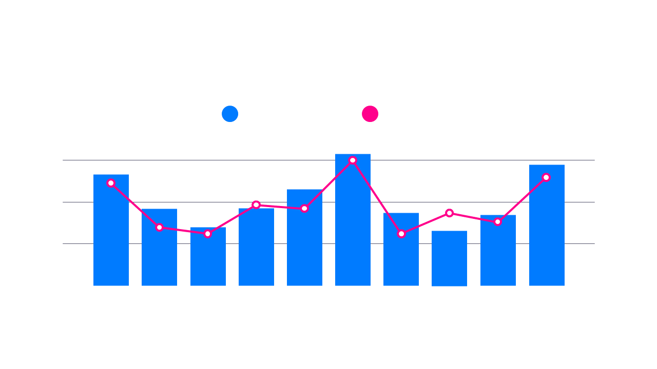
As a data analyst, you often need to convey complex information in a way that’s easily digestible. This dual-series chart allows you to present two sets of data side by side, making comparisons straightforward and intuitive. Visually, it combines vibrant bars with a clear line graph, ensuring that your audience can grasp trends quickly and effectively. For a finance lead, this chart can illustrate financial performance over time, such as comparing quarterly revenue against projected targets. This powerful visual aids in identifying discrepancies and guiding strategic decisions. Meanwhile, a business analyst can use this slide to showcase market trends, comparing sales figures against competitor performance. This helps in identifying opportunities for growth or areas needing attention. You can easily customize the colors and labels to fit your brand’s style. $0.99 — add this single slide to any deck from the SlideSwift Slide Library. No subscription needed. Mix slides from any category to build your perfect deck.
Add more from this category to your custom deck