SlideSwift
By Category
💼Business 📊Infographics □Minimal 🕐Timelines ✨Neumorphic 🗑Diagrams 🔄Flow Charts ✨Glassmorphism 🎨Creative 🌍Abstract 🔄Cycle Diagrams 💎Isometric 🖼Illustrations 📱Social Media 🗺MapsBy Slide Type
🚀Pitch Deck 📌Roadmap 🔍SWOT Analysis 📅Timeline 📈Gantt Chart 🏢Org Chart 📋Funnel ⚖Comparison 📄Case Study 📋Agenda ⭐Icons & Lists 👏Thank You
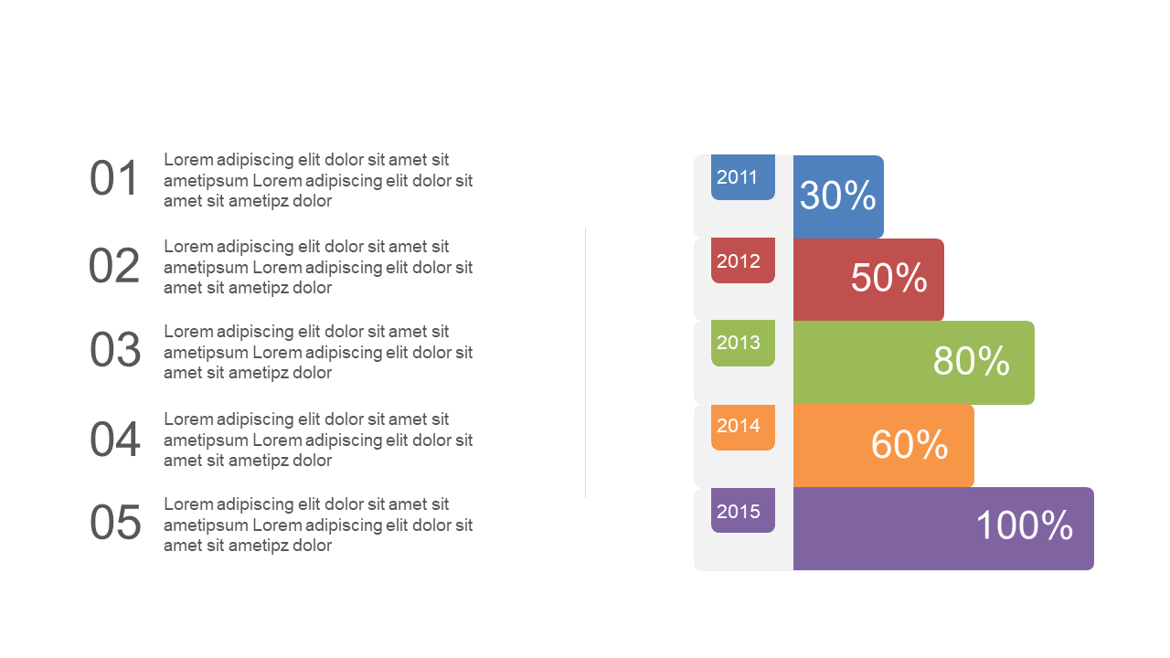
Data analysts frequently face the challenge of presenting complex performance metrics in a clear and engaging manner. Visualizing data can make all the difference, and this horizontal bar graph slide does just that. It showcases colorful segments with percentage labels, allowing your audience to grasp key insights at a glance. A well-structured graph like this can turn mundane data into compelling stories. As a data analyst, you can use this slide to highlight trends in performance over time or compare different metrics side by side. Meanwhile, a finance lead can leverage this slide to illustrate budget allocations or spending patterns in a straightforward way. Additionally, a business analyst can utilize it to present operational efficiency metrics, facilitating informed decision-making. Customizing the text, colors, and data values is simple, ensuring that you can tailor it to fit your specific presentation needs. $0.99 — add this single slide to any deck from the SlideSwift Slide Library. No subscription needed. Mix slides from any category to build your perfect deck.
Add more from this category to your custom deck