SlideSwift
By Category
💼Business 📊Infographics □Minimal 🕐Timelines ✨Neumorphic 🗑Diagrams 🔄Flow Charts ✨Glassmorphism 🎨Creative 🌍Abstract 🔄Cycle Diagrams 💎Isometric 🖼Illustrations 📱Social Media 🗺MapsBy Slide Type
🚀Pitch Deck 📌Roadmap 🔍SWOT Analysis 📅Timeline 📈Gantt Chart 🏢Org Chart 📋Funnel ⚖Comparison 📄Case Study 📋Agenda ⭐Icons & Lists 👏Thank You
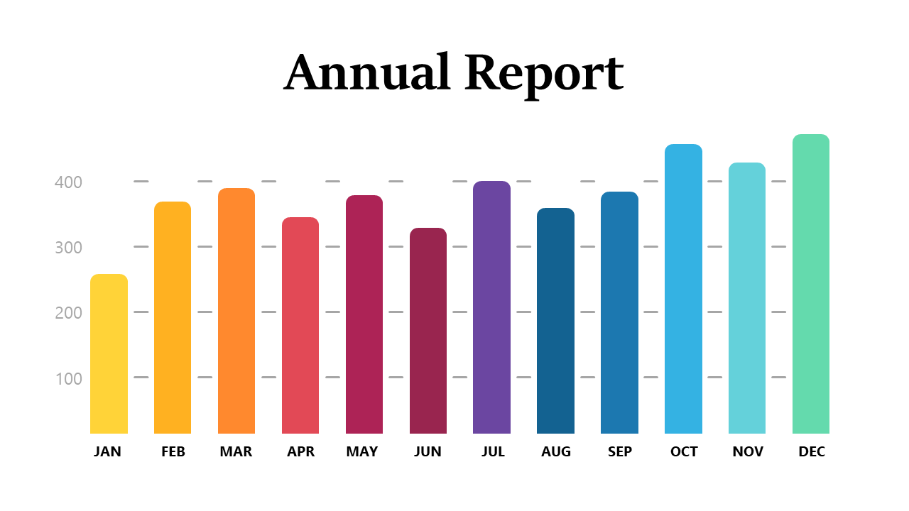
Are you tired of dull presentations that fail to capture your audience’s attention? Engaging visuals can make all the difference, especially when sharing important metrics. This slide showcases a colorful bar chart with distinct segments that represent various data values, making it easy for your colleagues to grasp key performance indicators at a glance. Imagine dropping this vibrant slide into your presentation tomorrow morning and instantly elevating your message. As a reporting manager, you can utilize this slide to highlight quarterly achievements or project progress in a way that resonates with your team. For data analysts, this slide is perfect for summarizing complex datasets with clarity and impact, making your insights more understandable. Finance leads can also leverage this colorful design to present budget allocations or financial forecasts in team meetings. The chart is easily editable in PowerPoint, allowing you to customize colors and data to fit your specific needs. $0.99 — add this single slide to any deck from the SlideSwift Slide Library. No subscription needed. Mix slides from any category to build your perfect deck.
Add more from this category to your custom deck