SlideSwift
By Category
💼Business 📊Infographics □Minimal 🕐Timelines ✨Neumorphic 🗑Diagrams 🔄Flow Charts ✨Glassmorphism 🎨Creative 🌍Abstract 🔄Cycle Diagrams 💎Isometric 🖼Illustrations 📱Social Media 🗺MapsBy Slide Type
🚀Pitch Deck 📌Roadmap 🔍SWOT Analysis 📅Timeline 📈Gantt Chart 🏢Org Chart 📋Funnel ⚖Comparison 📄Case Study 📋Agenda ⭐Icons & Lists 👏Thank You
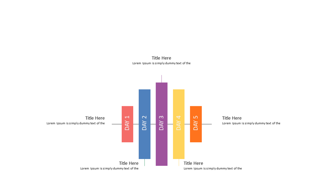
When you need to present data clearly and effectively, this colored bar graph will serve as a powerful tool. With its vibrant colors and clear layout, it illustrates progress over five days, making it easy for your audience to understand trends quickly. Picture dropping this slide into your PowerPoint presentation tomorrow morning, instantly enhancing your data storytelling. As a finance lead, you can highlight critical changes in financial metrics over the week, ensuring your stakeholders grasp the key points immediately. For a business analyst, this slide allows you to visually compare daily performance metrics and spot trends that require attention. Meanwhile, a reporting manager can utilize this graph to summarize team achievements succinctly, making sure that everyone is aligned on progress. Customizing the graph is simple; you can change colors, sizes, and text to match your specific needs. $0.99 — add this single slide to any deck from the SlideSwift Slide Library. No subscription needed. Mix slides from any category to build your perfect deck.
Add more from this category to your custom deck