SlideSwift
By Category
💼Business 📊Infographics □Minimal 🕐Timelines ✨Neumorphic 🗑Diagrams 🔄Flow Charts ✨Glassmorphism 🎨Creative 🌍Abstract 🔄Cycle Diagrams 💎Isometric 🖼Illustrations 📱Social Media 🗺MapsBy Slide Type
🚀Pitch Deck 📌Roadmap 🔍SWOT Analysis 📅Timeline 📈Gantt Chart 🏢Org Chart 📋Funnel ⚖Comparison 📄Case Study 📋Agenda ⭐Icons & Lists 👏Thank You
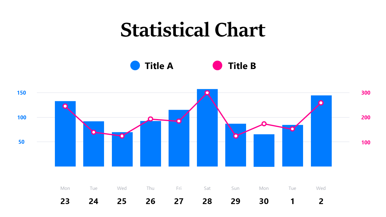
Imagine walking into your next meeting with a clear, visually engaging chart that highlights key data insights. This dual-series statistical chart combines both bar and line elements to effectively present information, allowing you to compare trends side by side. The bars can represent one data set, while the line tracks another, providing a comprehensive view of your data. For finance leads, this slide is perfect for showcasing quarterly revenue against expenses, ensuring your team understands the financial narrative at a glance. Business analysts can utilize it to illustrate market trends versus sales growth, helping stakeholders make informed decisions. Reporting managers will find this slide invaluable for presenting monthly performance metrics alongside targets, making it easy to identify areas for improvement. You can easily customize the colors and data points to fit your needs. $0.99 — add this single slide to any deck from the SlideSwift Slide Library. No subscription needed. Mix slides from any category to build your perfect deck.
Add more from this category to your custom deck