✦ Slide Picker: Pick individual slides from 7,486+ designs — $0.99/slide. No subscription. Mix any category. Explore → | ✏ Edit Online After Purchase — No software needed
Home›Charts and Graphs›Analyze Data Trends with Dual-Series Chart

Analyze Data Trends with Dual-Series Chart

✨ Slide Library 🛡 7-Day Money-Back Guarantee ✏️ Edit in Slide Editor 🔒 Available after purchase PowerPoint Google Slides

Product Description

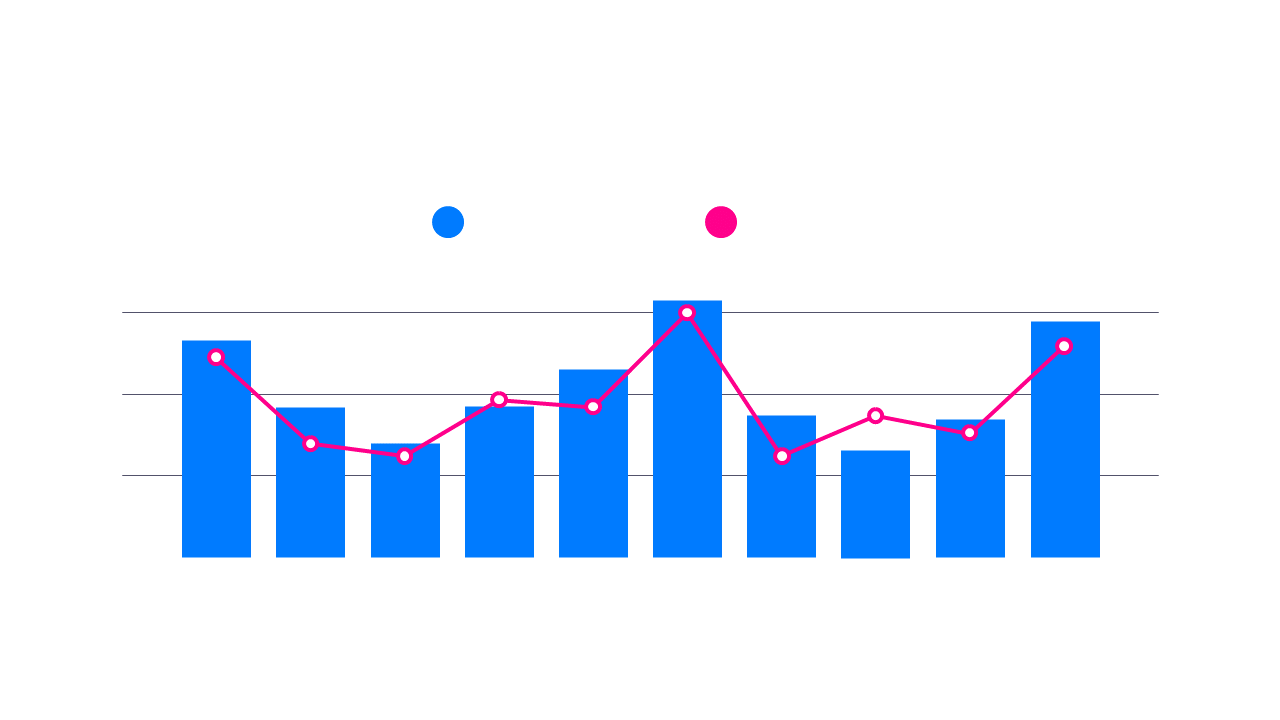
As a data analyst, conveying complex information can be a significant hurdle, especially when you need your audience to grasp the insights quickly. This dual-series chart allows you to position two data sets next to each other, simplifying comparisons and enhancing understanding.

It’s ideal for professionals in finance, research, or operations who frequently analyze trends and outcomes. Use this chart in presentations, reports, or meetings where clear data visualization is critical to communicating your findings effectively.

For just $0.99, you can download this slide instantly and begin editing it right away in PowerPoint or Google Slides. Customize the bars and lines to represent your specific data sets, ensuring your analysis is both accessible and engaging.

$0.99 – Purchase Checkout

Added to cart

✅ Instant delivery ✅ Fully editable ✅ PowerPoint & Google Slides
Category:
$0.99
Per slide · No minimum · Pay only for what you pick
Checkout →
✓ $0.99/slide No minimum order
✓ Mix any category No subscription
✦ Upgrade to Full Deck
Get all 14 Charts and Graphs slides
$4.99 one-time
Bold Charts and Graphs PowerPoint Templates Bold Charts and Graphs PowerPoint Templates Bold Charts and Graphs PowerPoint Templates
🌗Light & Dark themes both included
✏️Edit in browser — no software needed
🔍Preview all 14 slides in PDF before buying
🛡7-Day Money-Back — zero risk
⚡Instant download — lifetime access

More Charts and Graphs Slides

Add more from this category to your custom deck










